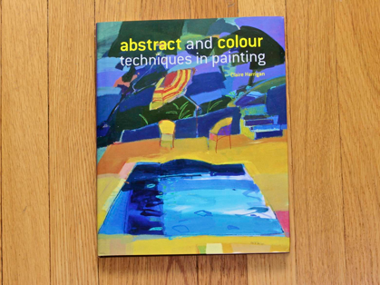
I checked this book out so many times from the library, I finally bought it with one of my amazon credit card coupons. I’m so glad I did! I find this book very inspirational. Claire Harrigan’s paintings I think are stellar but her advise is just as good. You can see in the sneak preview photos from the book below, her artwork as well as her person. I also summarize here her points that have had the most meaning for me. I give this book five stars. I hope you find a copy and enjoy it in its entirety.
She recommends learning about the following artists: Leger, Miro, Kurt Schwitters, Victor Pasmore, Graham Sutherland, Mark Rothko, Bridget Riley, David Hockney, Ben Nicholson, Patrick Heron, Howard Hodgkin, Alber Irvin. I’m working my way through this list; some are easier to find information about than others.
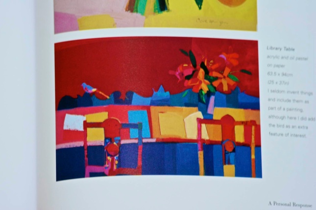
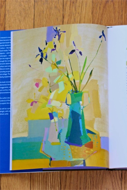
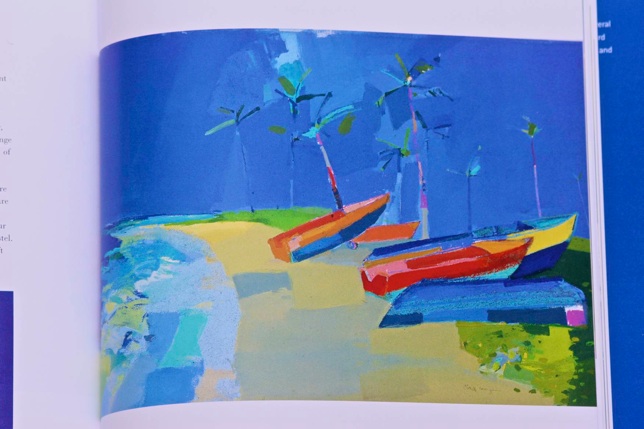
These are Claire Harrigan’s words in purple:
“I believe it is important to make a personal, emotional response rather than be constrained by a objective, representational approach, so I am not afraid to select, simplify, distort or use whatever devices are necessary to interpret the subject convincingly.”
“Aim for expression rather than realism.”
“Pick a busy subject – it is easier to simplify something busy than something already limited. Complex subjects make it easier to isolate areas and to create a design with real impact.”
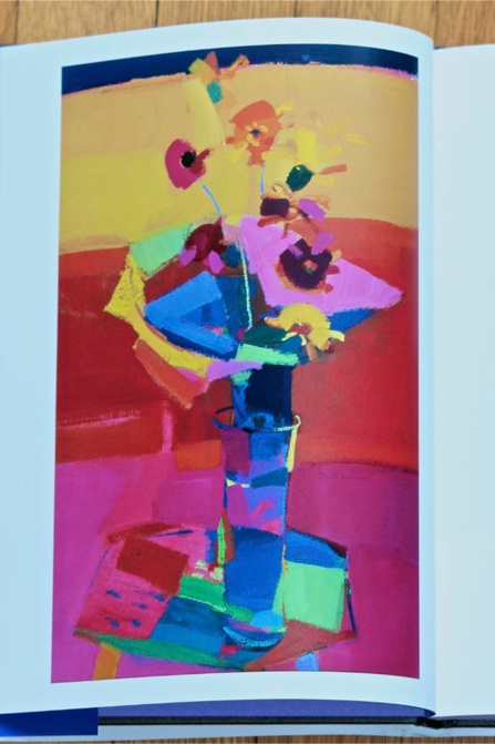
“It is often more effective to restrict the color range and perhaps exploit differences in colour intensities and characteristics.”
“The play of light often suggests interesting ways to divide up the composition and so produce an exciting relationship of shapes and colors.”
“I do not try to interpret what is there. In effect I am interpreting the subject matter through a process of analysis and selection.”
“Very often an unusual viewpoint creates a more dynamic composition.”
“Try painting the same subject from different viewpoints.”
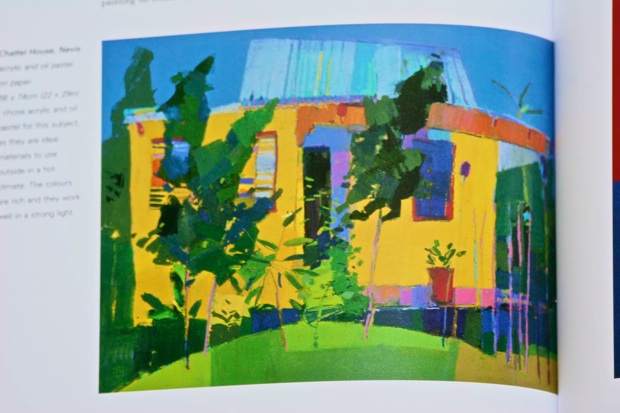
“I approach buildings in a similar way to landscapes – be sympathetic to a sense of place, focusing on what I feel about the building rather than aiming for a detailed description.”
“Think of a composition as having four quarters and try to ensure that something different happens in each of these areas. Also composition needs areas of ‘rest’ as well as areas of intense interest. Also focus on proportions of ‘thirds’ in a composition.”
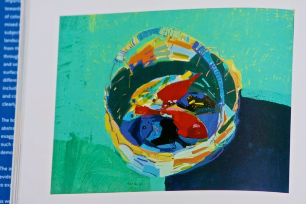
“I regard objects and background shapes as equal contributing elements.”
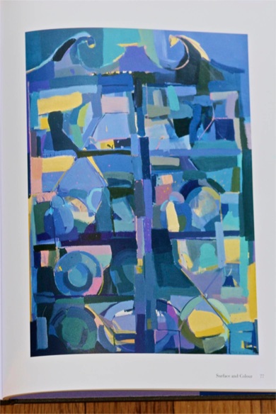
“Whatever impresses me about shapes and colors, I never develop the idea to a completely abstract conclusion. There are always recognizable features that link the painting to the original subject matter.
“The background shapes and colors can be just as important as those found within and between the actual objects.”
“I have found interesting effects are possible in acrylic over oil pastel and then, while the paint is still wet, removing some of it with a palette knife. Equally, I like the various gestural marks that oil pastels make when applied over dry or wet textural areas.”
“The most successful paintings, I think, are those that have a strong composition, original content, good color relationships, and a confident handling of materials using variations in marks and paint applications.”
“You must decide how much detail is essential, where you need this detail, and thus how much you can dispense with. Generally it is best to limit the amount of detail: it is more effective if used with discretion, perhaps to create a center of interest in contrast to the other areas that are treated as simple blocks of color. The amount of necessary detail may be negligible. For, instance, I often only suggest detail here and there, using oil pastel or colored pencils to add a few defining lines and textures.”
“Select and simplify shapes – if the pattern is too fussy, it tends to reduce the impact of the design. Initially, you may want to make some rough sketches to analyze the different shapes and help you define the most significant ones.”
“Contrasts between bold, dominant elements and those that are subtle and underplayed add to the interest and vitality of the painting.”
“In every painting, design and color are the key elements to think about most for if either is weak, the full impact of the work is lost.”