–
A blog reader I have never met (who lives in Calgary, Alberta, Canada) sent me this post and suggested I take the color class with the “color doctor” since it was in my state. So I did!
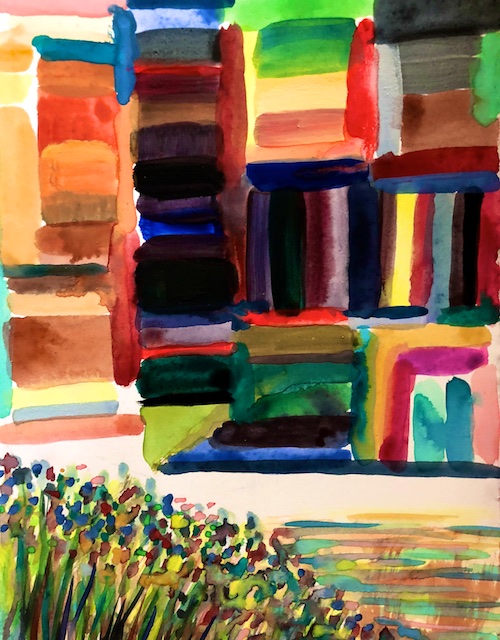
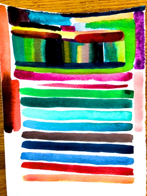
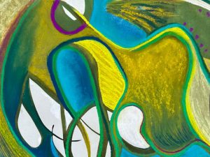
I was there last Saturday. In this post you can see a close up on some of my notes with two different color wheels, and two of my color mixing exercises.
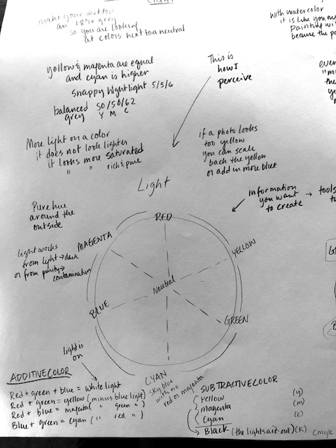
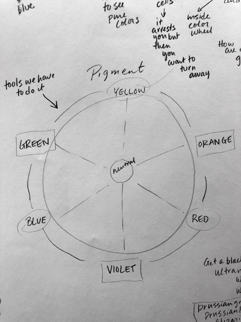
Most of this stuff I already knew, but it was interesting, none-the-less. Particularly fresh for me was the “color wheel of light,” where color mixes very differently than on the “pigment color wheel.” She had little flashlights with colored transparencies so you could see how color mixes in light. In light, for example, red and green mix to make yellow, which is both counterintuitive and very informative.
Light is the way we see and is how we get information about what we want to create. Pigment is the tool we use to represent that. So we need to translate what we see into the medium of pigment.
On the “color wheel of light,” the outer edge is lightest and purest, while moving in toward the center is darker and more contaminated. The more light you put on a color does not make it look lighter, however. Instead, it simply looks more saturated– more rich and pure. Because of the “light color wheel,” if a photo looks too yellow, when we edit it, we know that we can not only scale back on the yellow, but could add in more blue (opposite yellow on the light color wheel), which will have the same effect.
There are three types of light: direct light, reflected light (which bounces of something and influences it), and transmissive light (where you are seeing something through a filter or colored glass). To understand what color a shadow should be, we demonstrated with the colored flashlights that the shadow will be the opposite of the color of the light source (on the light color wheel) plus the color of the ground. It was a surprise to see a blue light create a yellow shadow.
She believes in a limited palate because it brings more harmony to the whole piece, since all those colors are seen in each other, with only the rarest pops of pure tone. She recommends choosing three colors (plus a version of white), even with pastels, and make mixtures of them exclusively, using only the barest flickers of the pure colors, “like rubies in the sand.”
She says neutrals challenge your eyes to want to see pure colors. Contrariwise, she feels that if you only use pure colors, it tires out the cone cells in your eyes; originally it can be arresting, but then you quickly want to turn away. Neutral (“spacial”) colors are the ones inside the “pigment color wheel.” They will sculpt space, bending and pushing back in the picture plane. Pure colors, on the other hand, reside on the edge of the “pigment color wheel.” They will jump out, and sit up on the surface, kind of flatly.
You should photograph artwork neither in light or shadow, but on a cloudy, overcast day, because you want even, mid-range, natural light. Don’t edit photos in bright light or at night either, but in medium north light with an 18% grey desktop, so you are looking at color adjacent to a true neutral. She recommends painting under a 5000 Kalvin LED light, saying that it is the best way to view color. She also advocates asking what your printer’s “color profile” is, so then you can define and calibrate your image on your end.
Other thoughts:
- Try compression charcoal rather than vine charcoal, because it is a better rich dark.
- For a cool black: mix Ultramarine Blue + Burnt Umber
- For a warm black: mix Ultramarine Blue + Burnt Siena
- For “space black”: mix Prussian Green + Prussian Blue +Alizarin Crimson
- Even in “mud” there is yellow, red and blue!
- With watercolor, it is like you are painting with the “light color wheel,” since the white of the paper factors in.
- In watercolor, putting a wash of gamboge over a landscape immediately creates the effect of the “golden hour.”
- Better than cadmium red is: Cadmium Yellow + Burnt Siena + Alizarin Crimson, because it will integrate with the rest of the painting.
- Fabriano hot press paper with watercolor has crisp edges and brushwork stays put when you put other layers over.
- Look at something and don’t name it. Never paint “local color.” Don’t think, there’s a copper pot, so I need a copper color. Draw and paint what you see without your preconceptions, and color in namable objects with the tones that they share.
- Compare Raphael’s drawings (with their air in the edges) with Michelangelo’s drawings (that use all closed edges). Go for more open edges.
- I also loved her stories both of having De Kooning as a mentor, and of her adventures teaching art to all sorts of people.
–
Related Articles


1 Comment
-
Thanks for coming to the workshop Polly. I just want to clarify a few things that you mentioned. The geometric volume of color space moves in two directions. The horizontal movement from the outer edge of the circle to the middle core is the change from pure color to contamination (and neutral color at the core). There is also a vertical movement – picture the core as a shaft of a gray scale – which is where the color value between light and dark happens. There is hue (color name), saturation (amount of wanted colors in a hue), and value (the gray tone from white to black). The color space is a volume that includes all possible values (lights and darks) and colors (pure and all levels of contamination). The term for light temperature is Kelvin. I use 5000K for viewing color because it is a standard in the printing industry. Most people prefer to live under a lower warmer temperature of light. People can look at the color page on my website http://www.artatmurraypond.com and also see artwork on http://www.joanlevyartist.com

