–
As I stated in my art summery for last year that in this coming year my goals for my art are more about honing my skills. I’ll teach classes and take classes, challenge myself to expand and do new things, as well as get down and dirty about refining and examining details of the process.
I’ve already cleaned out my pastel area of my studio for a fresh start for for new work, and in acrylics am starting the year with some mark-making assignments for myself.
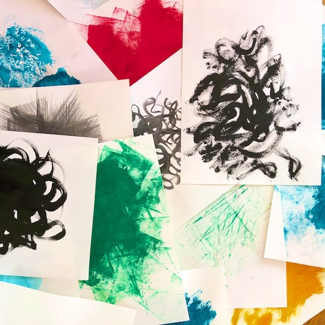
First I used some cheap drawing paper and tried out some fluid acrylics, as well as heavy body acrylics, with varying amounts of water, and with different implements, trying for a wide variety of paint masses. I tried to identify my default marks and avoid doing just those.
Then on bigger cheap paper (18″x24″) I tried to do blobs or “masses” of three different sizes, each different in character, then adding a few marks, patterns, or lines with oil pastel or watercolor crayon. My third criteria was to leave plenty of white space, as these are intended to be both unfinished and have lots of “breathing room.”
I was not going for finished compositions here, nor balance per se. The only goal was variety of marks, variety of size, and not too much of them. (Restraint can be so hard!) Below you can watch my process as I work to explore and grow. You can almost listen over my shoulder as I analyze what I’m doing. My comments for each photo are underneath each one.
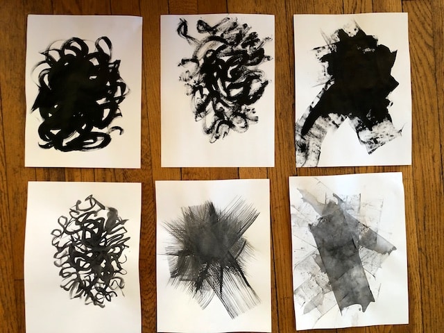
These were done with fluid acrylics, drier or wetter, with different brushes, and with a wet and dry brayer on the right side. I see only two different “strokes” here so tried to expand on that after this. The wet brayer was a new one on me and I like it; it would be great to do that again with transparent fluid acrylics.
This is with heavy body acrylics. I haven’t used these in a while, and liked them more than I remembered. I worked here on varying the strokes more, in varying amounts of water, and got experimental with the last two– printing my palette onto the page, and rolling the edge of my mostly cleaned off brayer around on the page.
More variation in marks and practicing my brayer hand, since I like the ghosting that occurs.
Now on to the 18’x24 cheap drawing paper:
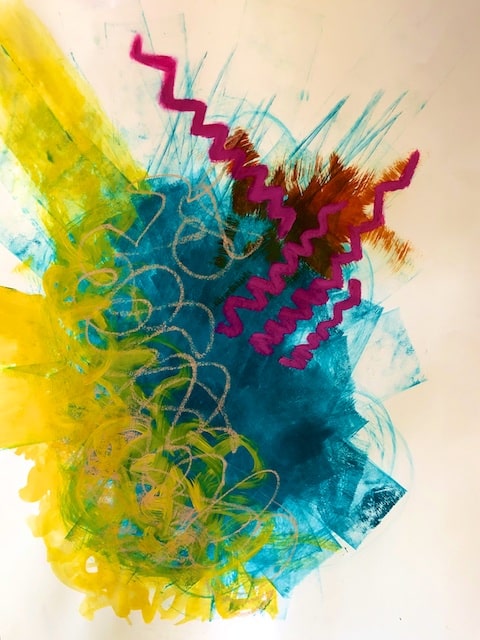
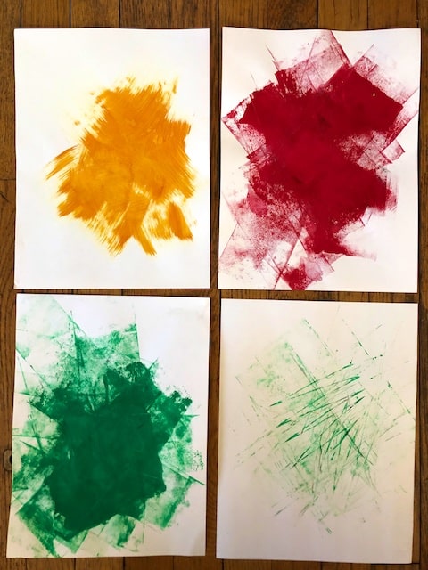
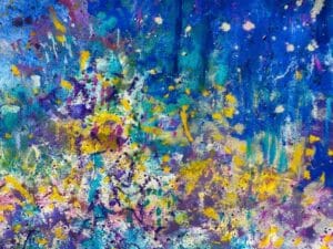
Here are a big heavy body teal brayer blob (complete with those edge spikes I liked), an area of yellow fluid acrylic painted in willy-nilly strokes, and a small nickel azo area done with a dry toothbrush. Topped with light peach watercolor crayon scribble, and heavy, smudged zig zags in magenta in oil pastel. I like this, but I think I need more white space, and maybe my two largest areas are too similar in size. I’ll try and address those issues in the next ones.
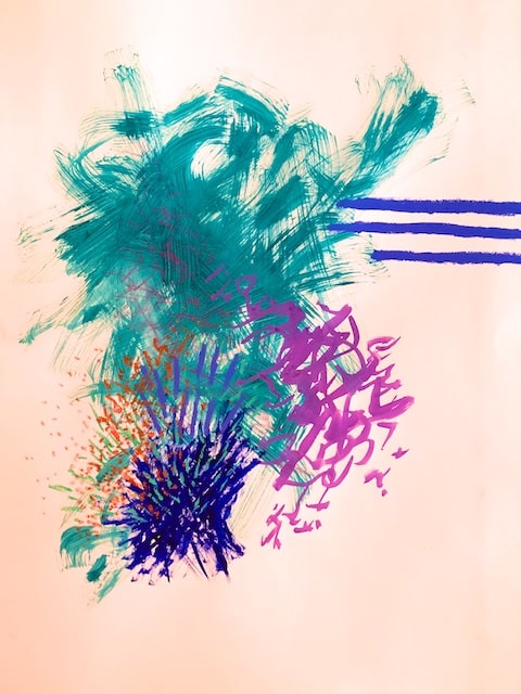
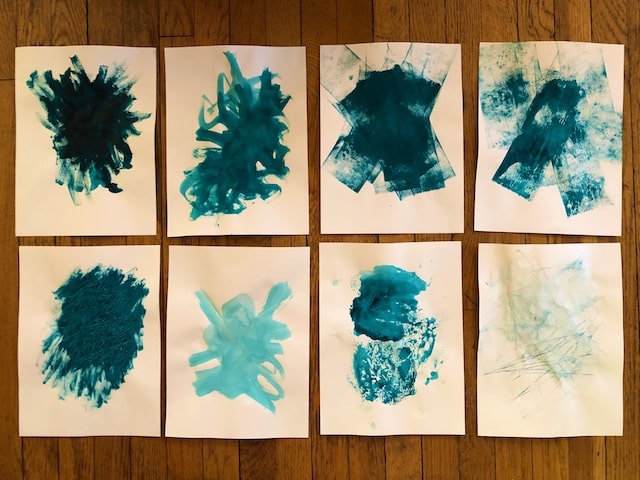
I left more white space here (although that photo looks peach for some reason???). The two smaller blobs now look more similar in size, but that is due to the blue oil pastel added later, which I guess isn’t working there for that reason. The rest of it, however, I like: the dry brush with the teal fluid acrylic, the smaller wet brush with the fluid light purple acrylic, and the small dry brush with the heavy body ultramarine. The watercolor crayon scribble with my left hand you can barely see over the large teal mass. Next time, I’ll try that again where I can see it better.
Three distinctly different masses of paint with very different qualities and implements, watercolor crayon where I can see it, oil pastel that doesn’t enlarge one of my areas in the wrong way, and plenty of white space leaving the viewer in limbo. Now I’m getting somewhere.
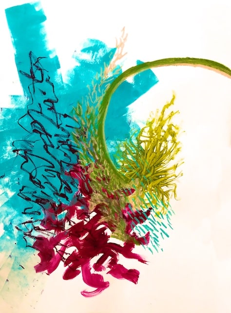
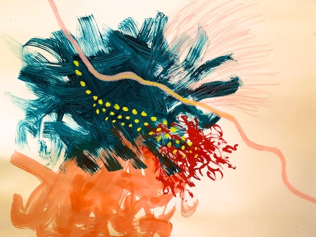
Here are big, medium, and small paint blobs, of very different paint character, but the green oil pastel made the smaller blob read bigger again, a fact I tried to mitigate with the pale flesh tone added on top. The little turquoise dash pattern on the lower right, however, worked, making the biggest area slightly bigger and more integrated. I’m not a fan, but there are elements I like and would do again. I like the one big brayer mark shooting up, and I like the left handed very dark watercolor crayon open scribble.
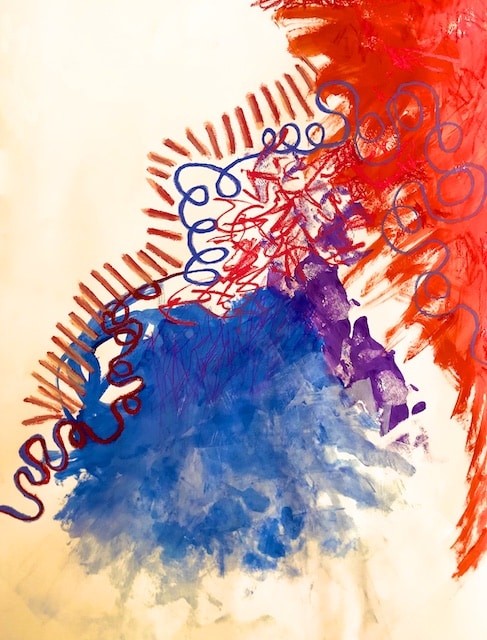
There is not enough white space here, and which is my biggest area? Again, my oil pastel (in red) tipped the scale here, and I’d probably like it better if I hadn’t put that there. But I like the one stroke irregular purple brayer mark, and how the blue blob feathers out and fades at the bottom.
Again, the two big blob here are too similar, and this feeling is exacerbated by the similarity of hue with the third blob.
I’m finding it helpful to analyze these things, because when actually working on a real piece in acrylic, I just go over and over until I’m satisfied. Furthermore in other mediums like pastel, I don’t have that luxury. These practice pieces with spare requirements challenges one to assess more at every stage, and even then, it is easier than one might think to achieve a different effect than intended!
All that said, I like the differentness in the individual qualities of each of these marks, and chose well making the yellow marks yellow (instead of red like I did in the previous piece), and feel that the wispy pink watercolor marks were a good choice too.
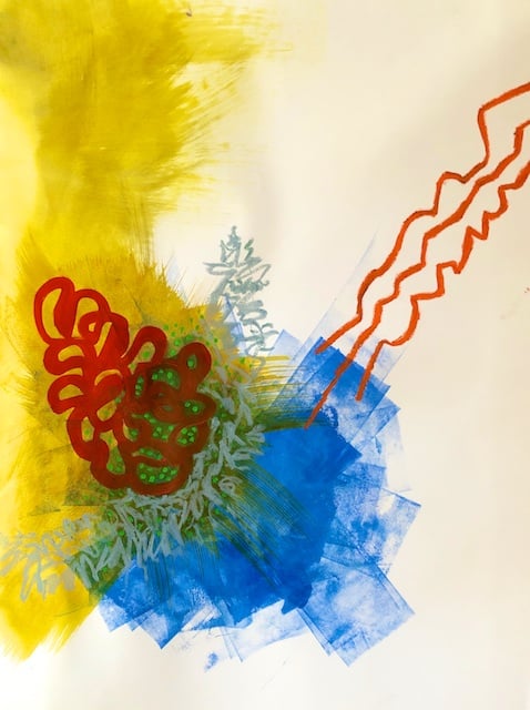
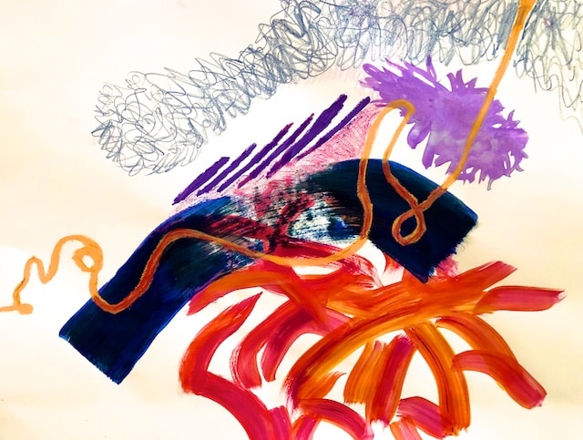
Well here is my last one: big feathery yellow, with medium sized brayered blue somewhat overlapping, and smaller, tightly controlled, right handed, thickly red loopy doodle. All that topped with gray left hand spikey scribble, three orange left hand jerky lines, and a few green dots, carefully placed.
What did I learn from all this? That you can’t practice too much. There is more involved in scribbling than you might think! And I already knew preserving white space, goes against my nature, but I’m trying. (It’s an apt metaphor, I pack in my life too, needing more margin.) What can I say? It’s a good thing I got a lot of cheap paper.
Anyone can do this stuff and it is fun. One idea leads to the next…
There will be more to this mark making series, probably next week. Meanwhile give me some feedback. Is this behind the scenes thinking process as I explore my art growth interesting or helpful?
–
Related Articles

7 Comments
-
Hi Polly!
The first image is OK. However, all the other images do not appear–only the reference like this: img_3201, which I clicked on and nothing happened.I double checked some of your other blogs that have images and they were fine.
MJ :)-
Author
Thank for telling me. It looks fine on both my phone and my Apple laptop. What are you looking at it on? Maybe it just took longer to load? I used a different format with text between images that is different than what I usually use. I’ll look into it. Anyone else having difficulty??
-
Please try again; I just fixed it.
-
-
-
Polly, I’m having the same issue with the pictures. I’m using an iPad.
-
Thanks. Please try again; I just fixed it.
-
-
Hi Polly,
(On my iPhone X I can see all the images.)
I very much enjoyed the explanations and descriptions of your process in each of the exercises. I find it educational for me, a non-artist, to read the words you use to describe your medium, your strokes, etc.
Your big paper exercise with the teal brayer “blob” with the yellow fluid acrylic in “willy-nilly strokes” was very pleasing to me; I also enjoyed the brayer strokes and the teal paints.
Pingbacks
-
[…] my third in this mark making series (see the first post here, and then the second post here) I am going to try to create unique marks with handmade […]


)