Not very many books out there on abstraction do I really feel I want to recommend. This one is the exception, even though it only explores abstract expressionism and non-objective art. Even so, I give it five stars, for what it covers, it does well.
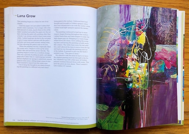
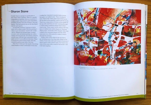
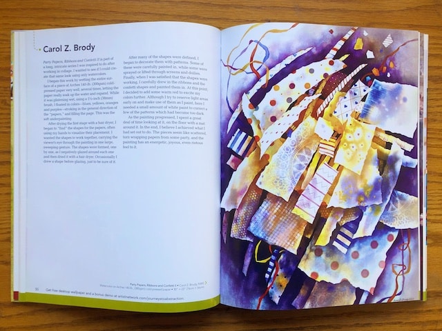
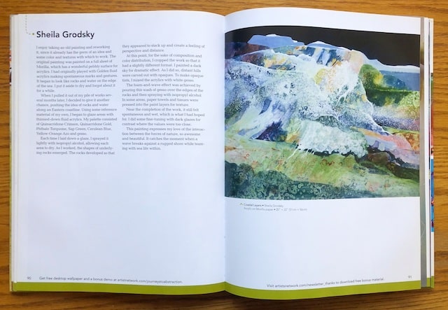
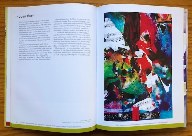
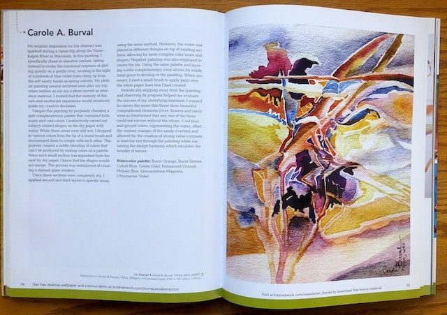
This is mostly a book of images, with side bars of the artists telling you how and why the piece is what it is. You can see example pages below. Throughout the trajectory, ideas are sparked, and creativity is encouraged.
This first set of bullet points I’ll share below are some notes I took for you from the author’s overview of abstraction. Below that are suggestions from the artists included in the book, who mostly work in acrylic, watercolor, or mixed media.
Here are my notes of the author’s general thoughts about abstraction (similar to many of my own, you may notice):
- Some artist simplify their images. Others distort simple shapes. Other artists limit information to mere suggestions. Choices are vast and nothing is wrong. The only limits are your imagination.
- Abstract art can be both liberating and a form of therapy.
- “Abstract art is less about the subject than the emotions and motivations the subject evinces.”
- Realism is rendering an object as closely as possible to what you see with your eyes. Abstraction is about ideas, emotions, themes. What is the goal of your work?
- Draw inspirations from your environment, a book, a memory, and idea, emotions, the work of other artists, intuition, basic shapes of objects, patterns.
- Notice shapes, patterns, color, and texture around you. Pay attention to those elements. “An abstract painting is a distillation of the artist’s environment.” Abstract painting changes the way you view the world. Focus on the details everywhere. Painting abstractly opens up new possibilities and broadens the senses.
- Artists sometimes use symbols. This is especially true of abstract artists who are in the process of distilling reality down to its elemental components.
- Colors effect emotions. Three color schemes that lead to color harmony: 1) Analogous colors (appear side by side on the color wheel). Because the colors are similar, this choice will give your work a soothing effect. 2) Complimentary colors (opposite on the color wheel) provides the most contrast and excitement. 3) Color schemes based on nature.
- Black= absence of all color. White= combination of all colors.
- Achieve balance using contrast. Too little contrast may be boring and monotonous. Too much contrast may be confusing, disjointed, or chaotic.Use color contrasts (compliments) to place emphasis on a particular area of your work. Get contrast through values, placing lightest light next to darkest dark. Get contrast through varying size, by putting small elements next to large ones. Get contrast by varying shape, for example, putting round shapes next to angular ones. Get contrast through texture, putting rough next to smooth.
- “Composition is to the visual arts what grammar is to the written word.” A properly composed artwork should flow and be recognized as a cohesive whole. Composition is comprised of texture, form, shape, line, color, value, movement.
- Knowing when to stop is vital. If you continue painting after it is time to stop, your painting my lose its vitality and freshness.
- Painter Robert Genn: “Eighty percent finished is better than two percent overworked.”
- Remember that your art is a form of expression and your work will not be successful if it does not express your point of view. Does it move others?
Ideas to try mentioned in the book (many of which I use, but have compiled here for my readers):
- Want watery acrylic work? Put matte medium on on watercolor paper (hot pressed if you don’t want bumps) and then excess acrylic can be easily wiped off if it becomes too thick or strong. Gives watery look because pigment will not sink into the surface of the paper.
- Calligraphic strokes can be done quickly with a squirt bottle. This is a spontaneous, surprise element with panache.
- Use needlepoint plastic square frames in wet watercolor and leave to dry. Also use them as stencils or stamps.
- Make sure your painting has a color dominance, either cool or warm.
- Spray acrylic painting with alcohol and then put wax paper over.
- Need unity and harmony? Put grey in.
- Add shapes in white acrylic at the end if too dark.
- Put paint on glass, draw lines into it if you wish, then press mulberry paper into the paint on the glass. Use a brayer to burnish it, then print it on your painting.
- Try letting the artwork tell you what to do next.
- Use colored pencil as details over watercolor.
- Use “cobweb webbing” taped down over Yupo and then spray with watercolor. Allow to dry completely before lifting webbing.
- When collaging strips, try alternating the layers horizontally and vertically.
- Utilize process called twinning: one warm color, one cool color, one a staining color, one a sedimentary color.
- Apply one color over whole surface of Yupo paper. Apply another color sporadically over that same sheet. Spray with water. Place a blank sheet of Yupo over the first sheet and lift slowly.
- On Yupo, where you don’t like what you’ve done, tape it off and soak it in isopropyl alcohol. Then scrape it off with an old credit card.
- When painting on top of an old painting, paint first with “magic mix” (kept in an old dish soap bottle): 4 parts gesso, 2 parts matte medium, 2 parts water. Mixture is transparent enough to see colors and shapes from previous painting.
- Lay a rubber grid that is used to stop rugs from moving on wet paint topped with plastic wrap. Weight down with old magazines until dry.
- Over acrylic color, try using watercolor crayons of the same color.
- Make a strong opaque gray by mixing black and white gesso. Use it as a topcoat, blocking around colorful under layer.
- Keep your edges as loose as possible for as long as possible so you have more choices.
- Try painting what looks like collage pieces without actually using collage pieces.
- When tearing paper for a collage, use three pieces of each kind of paper in three different sizes. By composing in threes, you get a nice asymmetrical balance in the painting.
- Try white vine charcoal.
- Liquitex gesso has a greater percentage of marble dust in its compound which gives a better texture of strokes with grittiness.
- Try making a stain glassed window painting in watercolor, painting “wet into wet” in each “pane.”
- Do a painting that employs “negative painting.”
- Choose three different transparent watercolors to use and put each in a spray bottle with some water. Spray on watercolor paper, and place plastic wrap, waxed paper, cotton gauze, and kosher salt in different areas over the entire sheet. Allow to dry completely, and then collage or print over top.
- Try rice paper in a collage.
- Paint to create emotion in the viewer. Cool colors tend to create quiet or thoughtful feelings, while warm colors can create excitement.
- To create a painting by pouring, mix with distilled water until the consistency of light cream.
- Try painting a whole painting using only Burnt Umber, Titian Buff, Carbon Black, and White gesso.
- Try thin layers of crackle paste.
- Use india ink and watercolor, while spraying with water and letting it run.
- Try Morilla paper, which has a pebbly surface for acrylics.
- Try laying down a glaze of liquid acrylics, and spraying with isopropyl alcohol, and either allowing each area to dry, or daubing it up with a paper towel.
- Try creating a black sky for a dramatic effect.
- Try opaque gesso over transparent washes, sprayed with isopropyl alcohol, pressing tissues and paper towels into paint layers for texture.
- Try adding dark glazes where values are too close.
- Leave the smaller shapes to the interior.
- Use the bottom of a fiber egg carton as a stamp.
- In mixed media, spray workable fixative over charcoal to add layers with no smear.
- Vary soft and hard edges.
- Place waxed paper over a wet application of watercolors.
- Try not to make shapes uniform. Variation is important in a painting.
- Do a bright multicolored pour, and come back into it with white paint.
- Use a limited palette of five colors, include warm and cool as well as compliments.
- Try Perlite, a texturing additive for paint, mixed with Liquitex gloss medium, painted on paper.
- Watercolor on Yupo must be set with acrylic spray.
- With watercolor on Yupo, put a tissue down in a damp area and brayer over it. The tissue will pick up part of the color. Glaze new color back into those spaces.
- With vine charcoal write random upper and lower case letters every which way to create interesting shapes, allowing them to overlap. Begin filling them in and see what emerges.
- Lay down (no lotion) Kleenex tissues on illustration board and pour watercolors (mixed the consistency of milk) over both the surface and the tissues. Tilt the board as desired. As the surface becomes less shiny, sprinkle on Kosher salt. Before completely dry, remove the tissues.
- Place waxed paper over wet application of watercolors
- Spray watercolors from spray bottles and use drips of diluted dishwashing soap to create puddling. This pushes the paint in loose, undefined patterns, and adds mystery.
- On a watercolor, use stencils to lift paint back to white paper.
- Move paint around with anything other than a brush!
- Touch the painting a different way each time you bring paint to the surface.
- Use black lines and dark shapes to make light shapes pop out.
- Grey down a painting if it is too raw, and increase intensity if it is too dull.
- Try using gesso mixed with a tiny bit of yellow to warm the white.
- Try mixing acrylic paint with GAC100 thinner by Golden and a little water to the consistency of honey.
- Try placing iridescent tinting medium next to titanium white for variation in your white areas.
- Spray mist isopropyl alcohol on paint on Yupo.
Wow. So may ideas to try out. Don’t you just love the vast infinitude of variables?
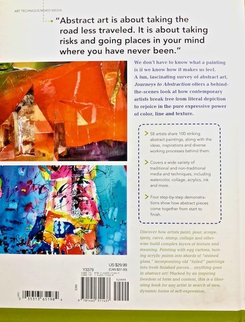
If this was interesting, you too may want to pour over this yummy book, Journeys to Abstraction. Apparently this is just book one, with three sequels, which I have just now added to my wish list.
Related Articles
2 Comments
-
How loving and generous of you to encourage our Sheltering-With-Time-For-Some-Art! Thank you!
I needed this. I read and study and pray (ok, and garden and write) but I need to let my Inner Painter-Artist OUT!
She’s been locked up too long in what I thought was More Important Endeavors, I believe Art helps me acknowledge All That-Is-Good-and-Real-and-True-in-Life, too, which is my main pursuit.;<)) Sue
-
Author
That’s how it see it!
-


)