–
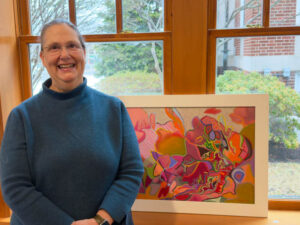
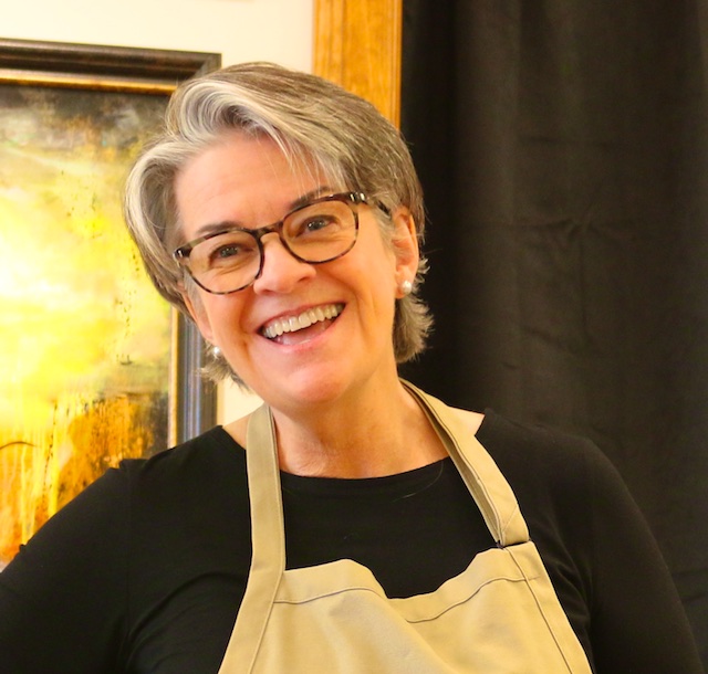
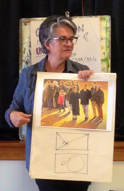
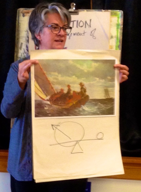
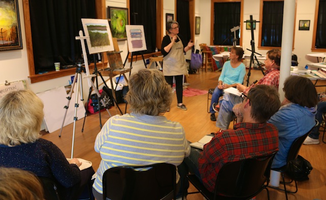
Last Thursday, Friday, and Saturday, I had the privilege of taking Deb Quinn-Munson’s three day workshop on what she calls the 80/20 rule of composition. The workshop was offered by the Connecticut Pastel Society, and was held at the Southington Community Cultural Arts Center which was a terrific venue for this in every way. Deb Quinn-Munson is a very accomplished painter as you can see here on her website. She also is a knowledgeable and congenial workshop instructor.
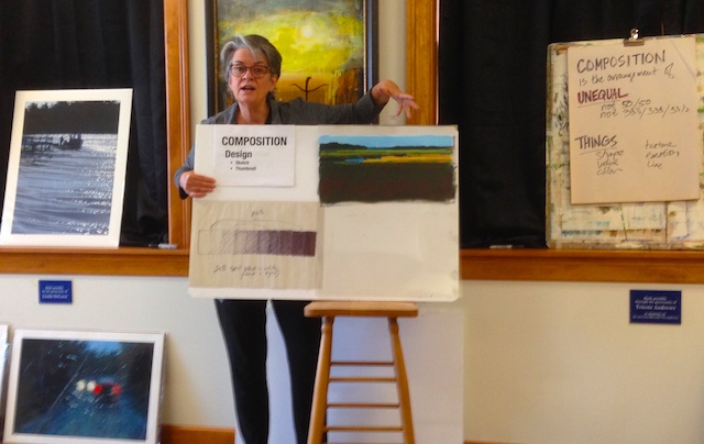
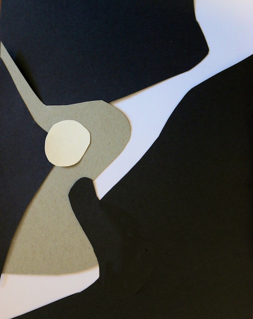
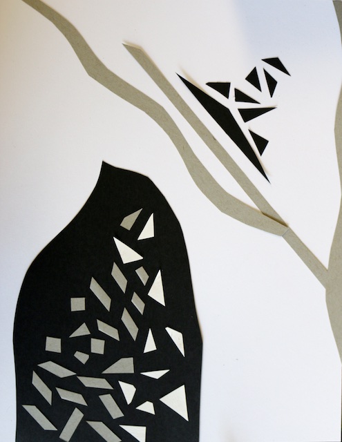
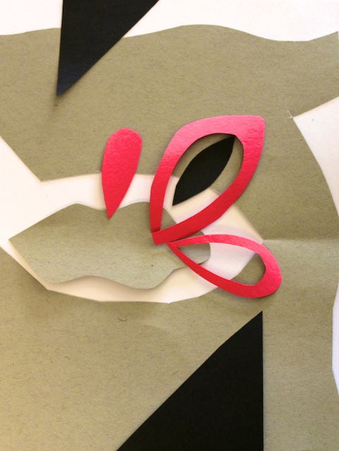
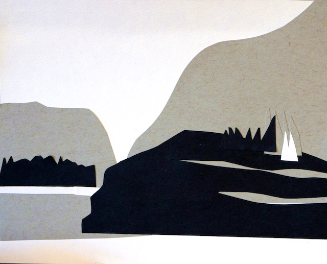
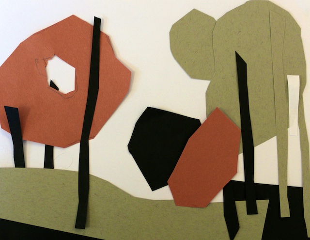
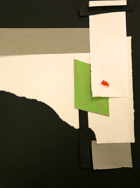
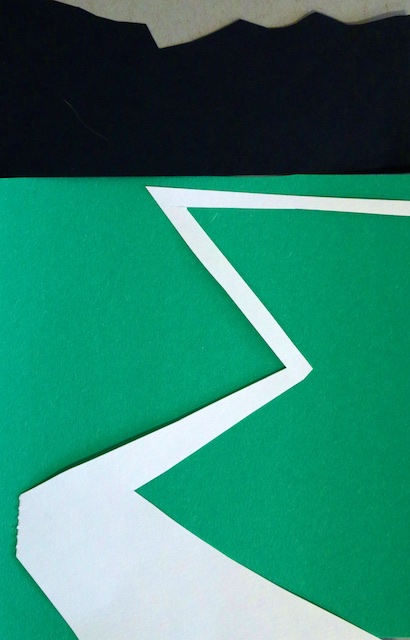
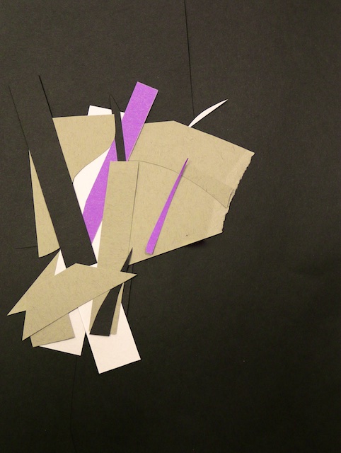
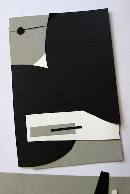
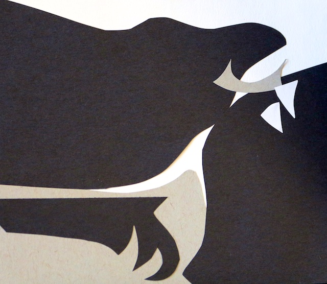
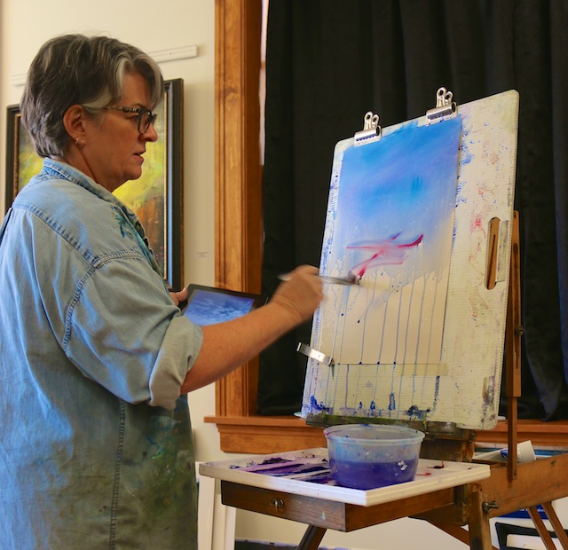
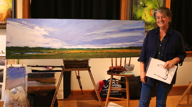
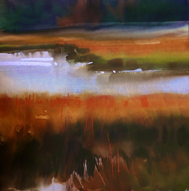
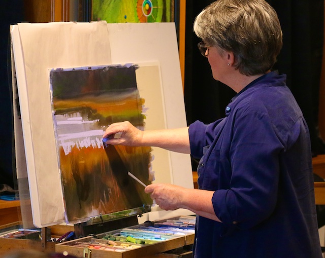
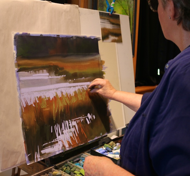
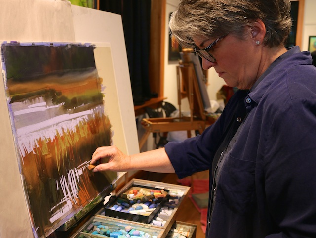
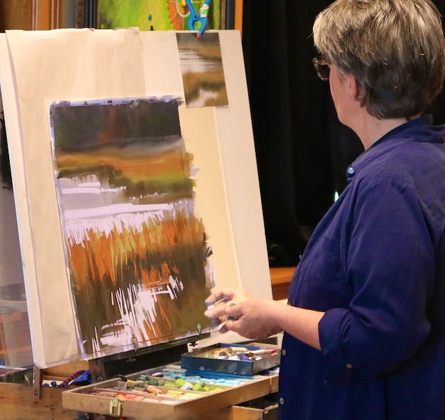
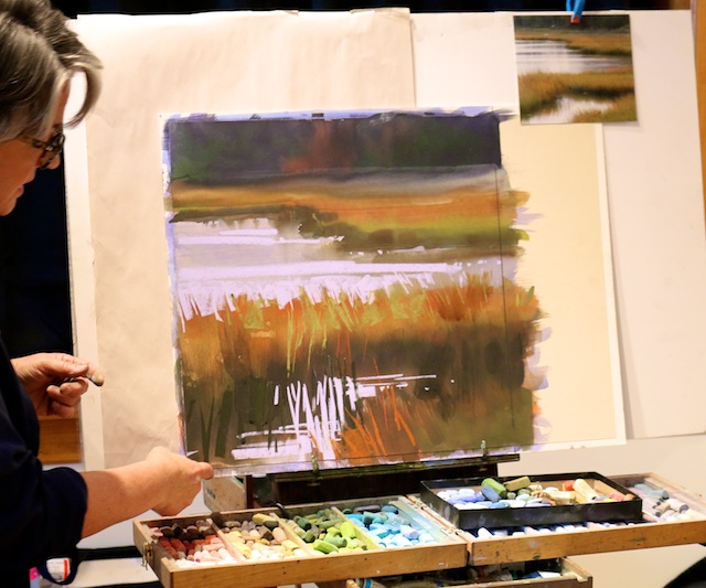
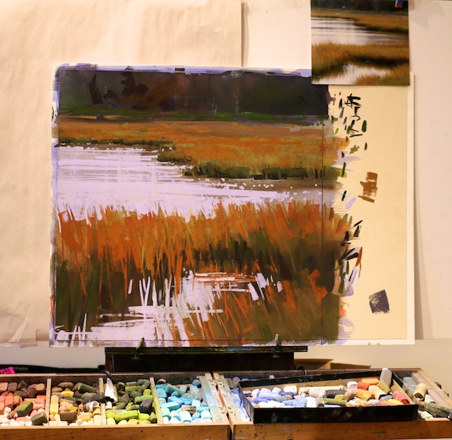
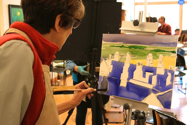
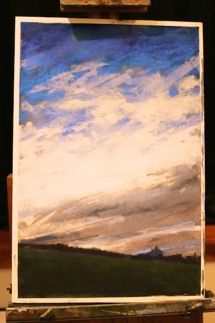
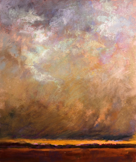
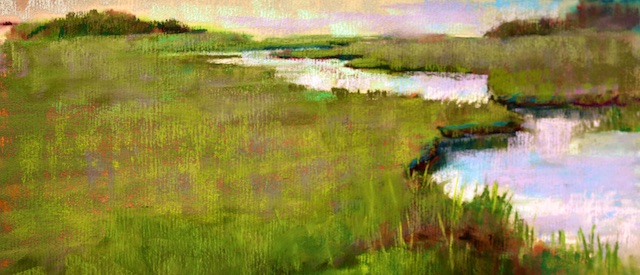
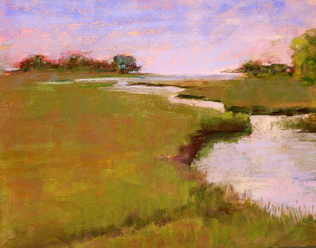
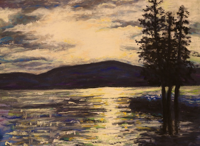
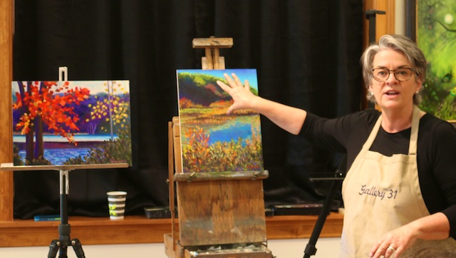
The first day, Deb talked about composition and we did a paper cutting exercise for how value plays into 80/20 compositions. After that we did an exercise of painting a scene with only 25 strokes, and then again with over 100 strokes. In subsequent days she did some demos, one of underpainting in watercolor, one of marshland, and another of mostly sky. At the end we had a critique of student’s work.
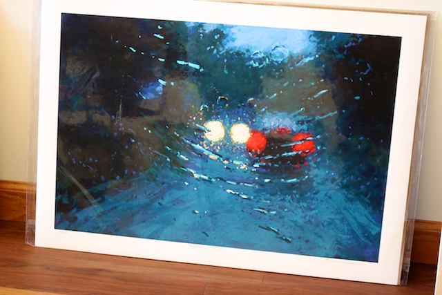
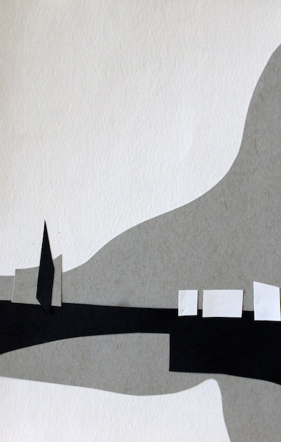
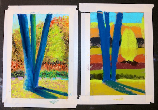
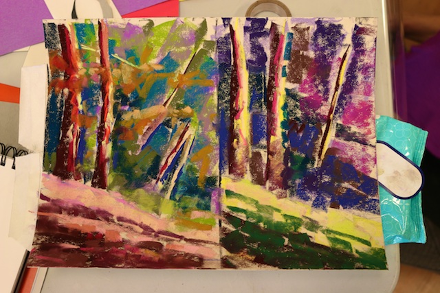
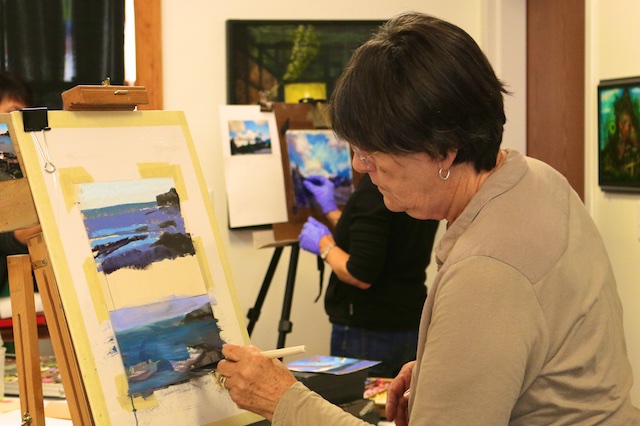
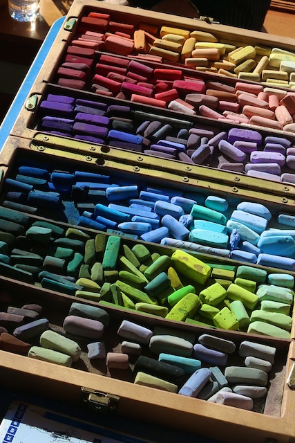
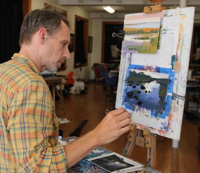
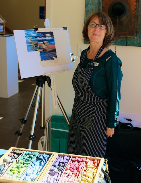
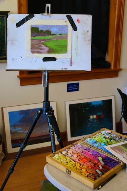
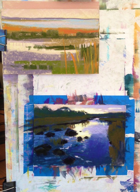
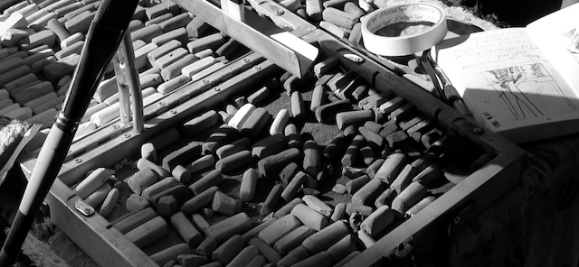
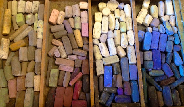
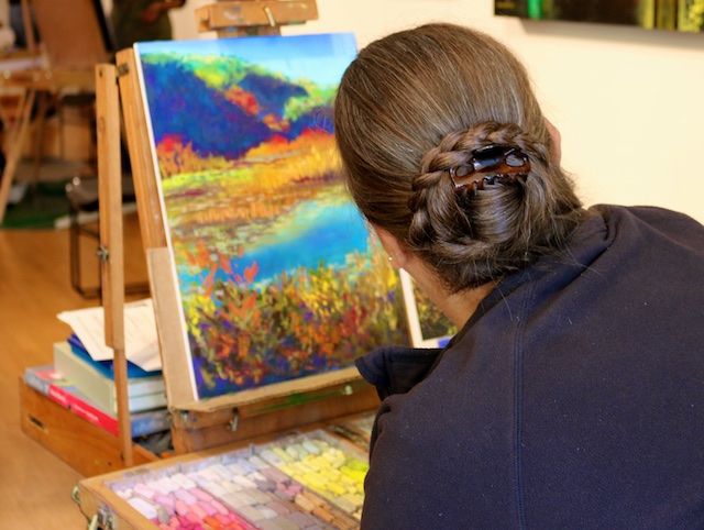
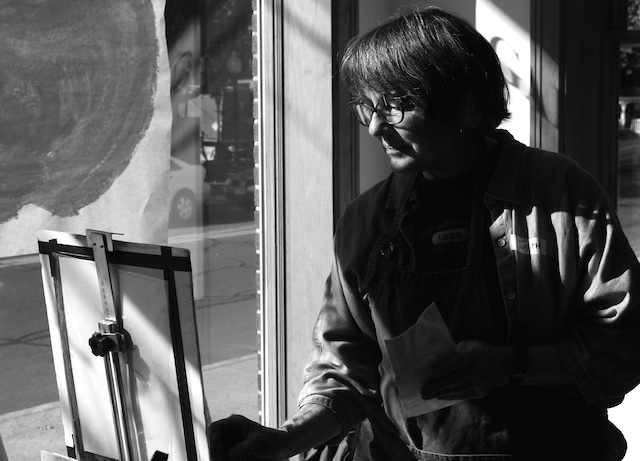
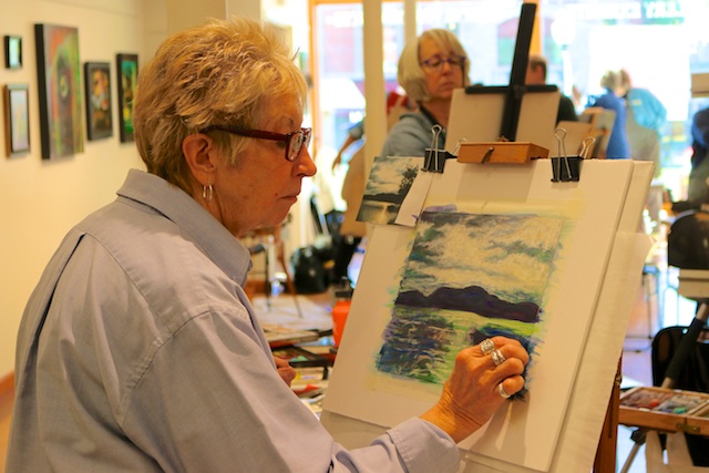
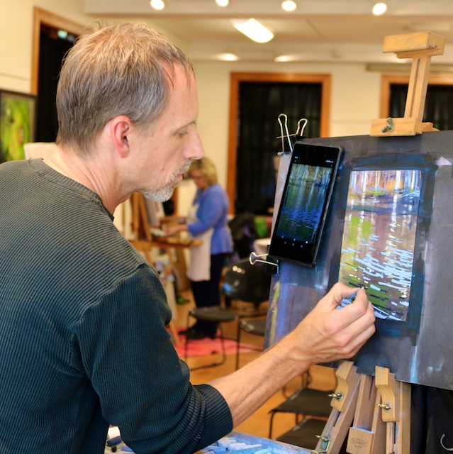
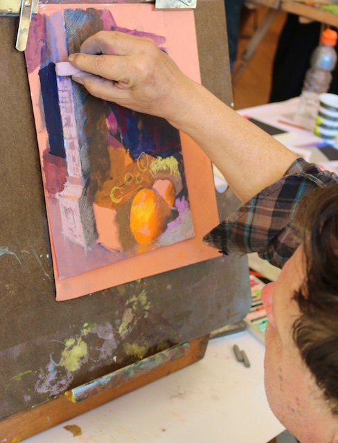
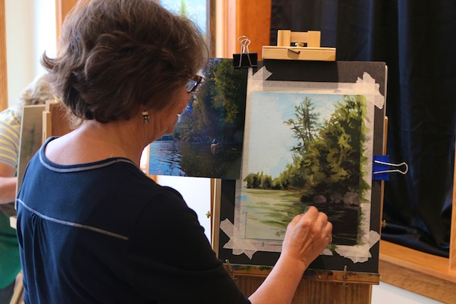
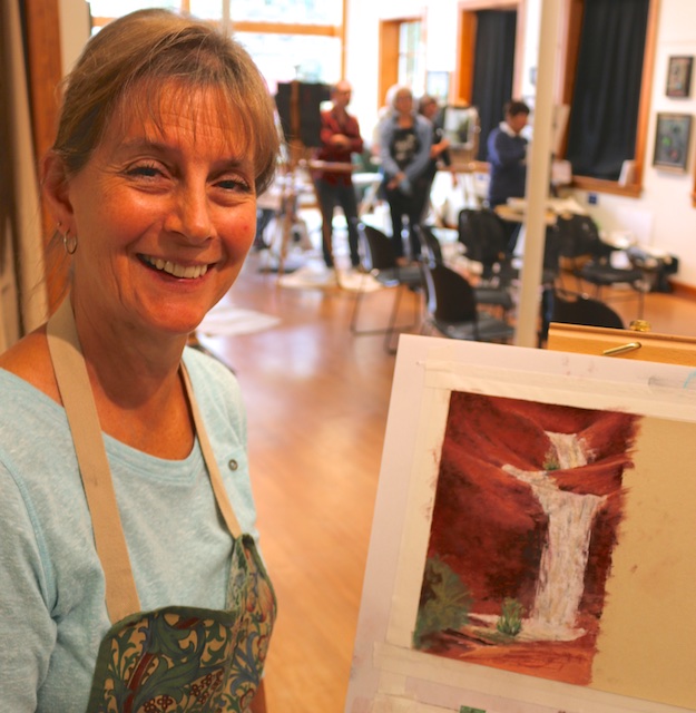
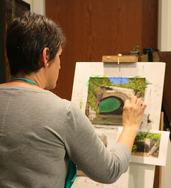
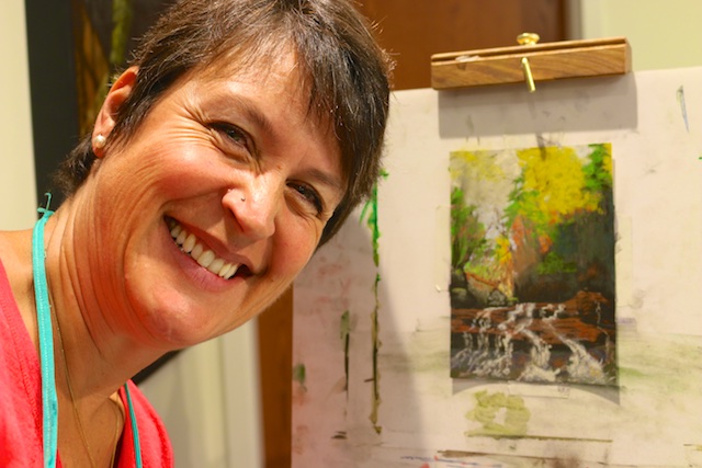
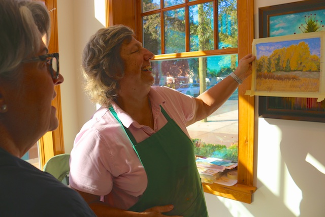
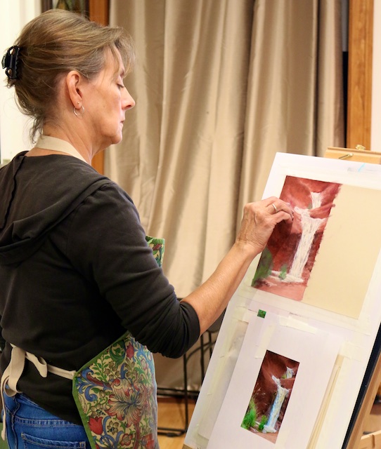
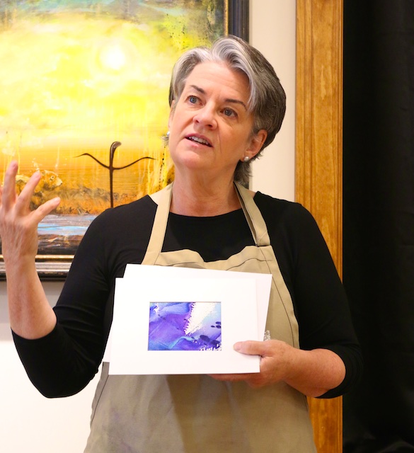
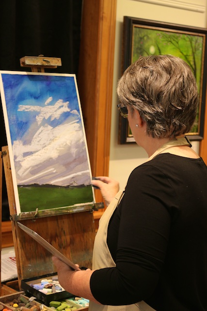
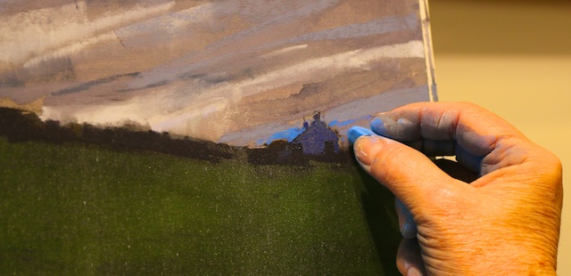
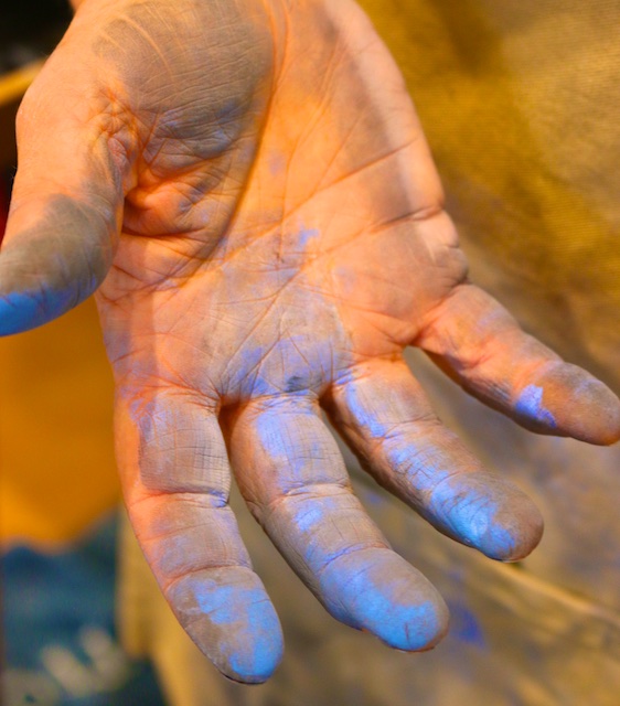
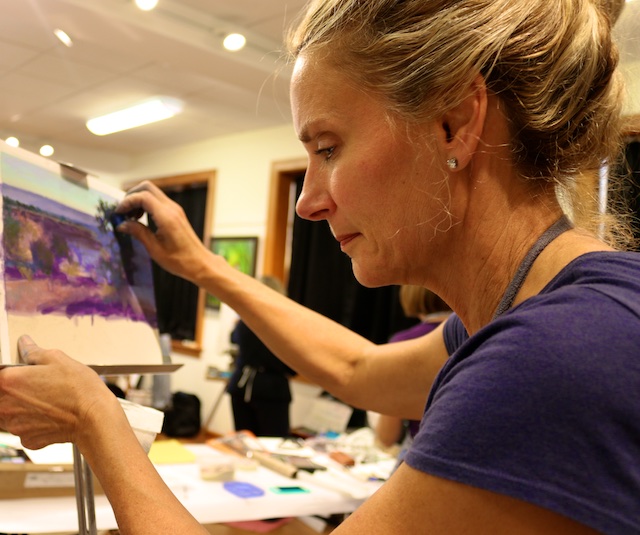
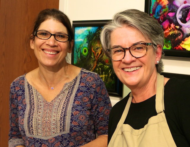
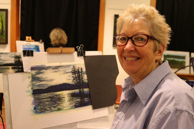
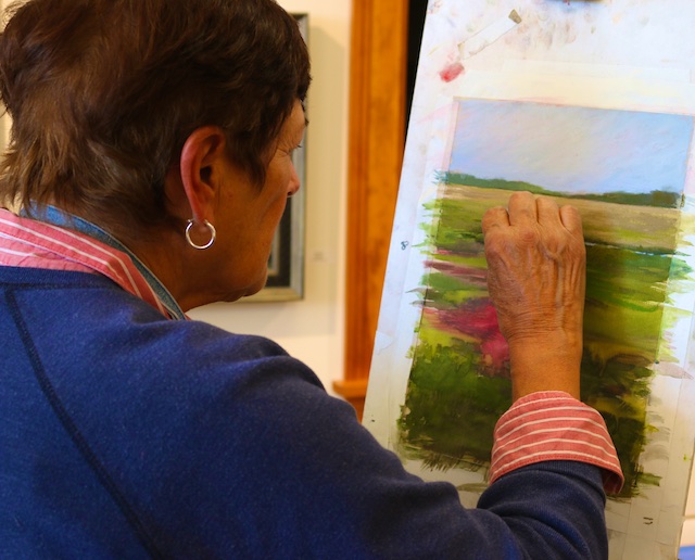
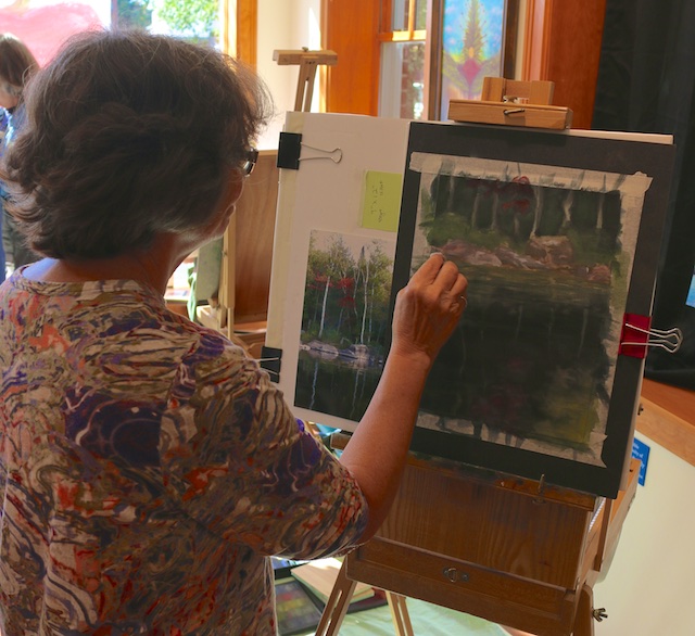
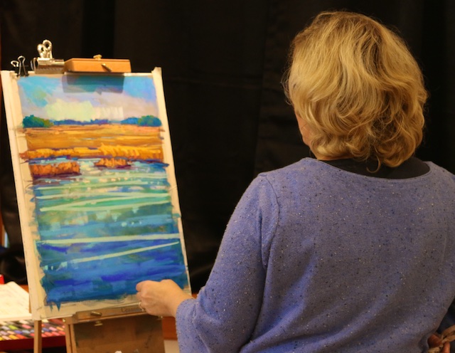
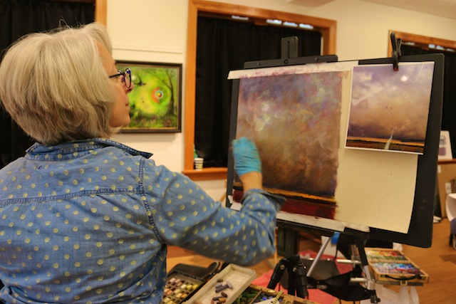
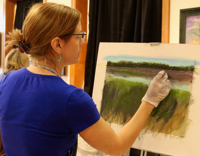
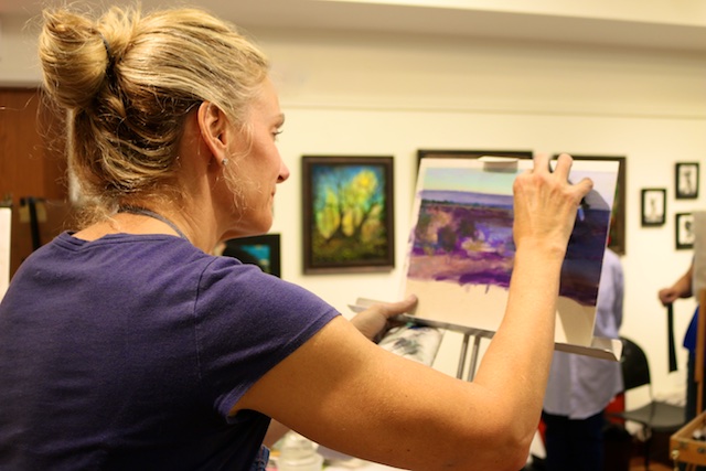
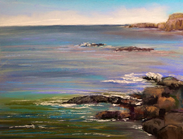
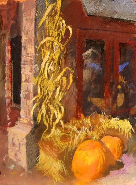
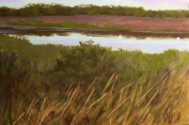
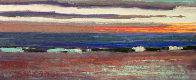
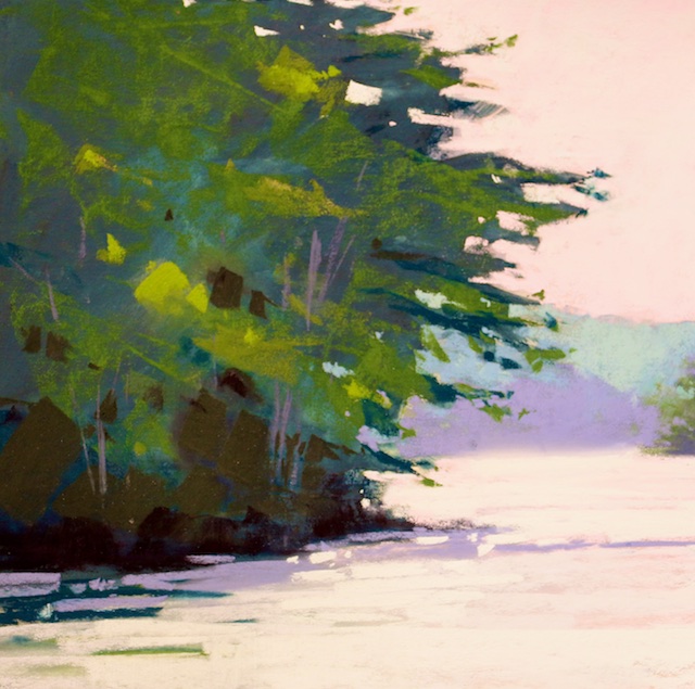
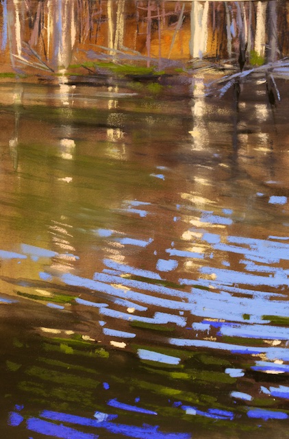
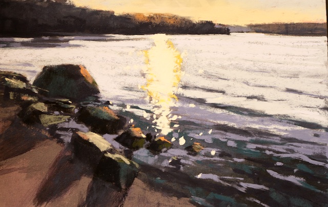
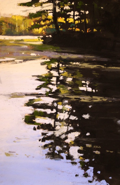
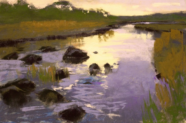
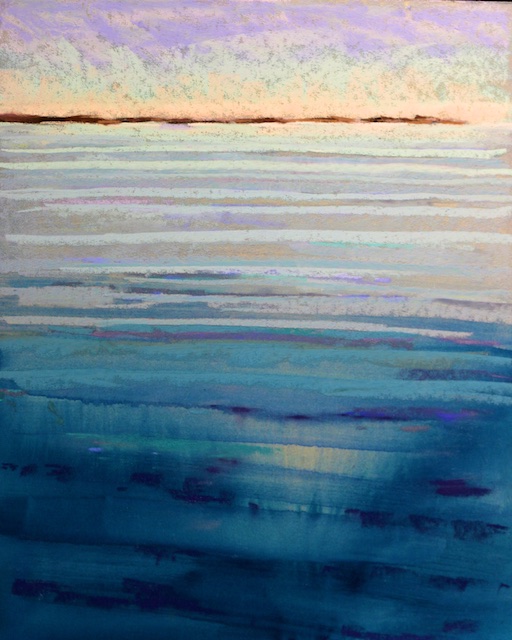
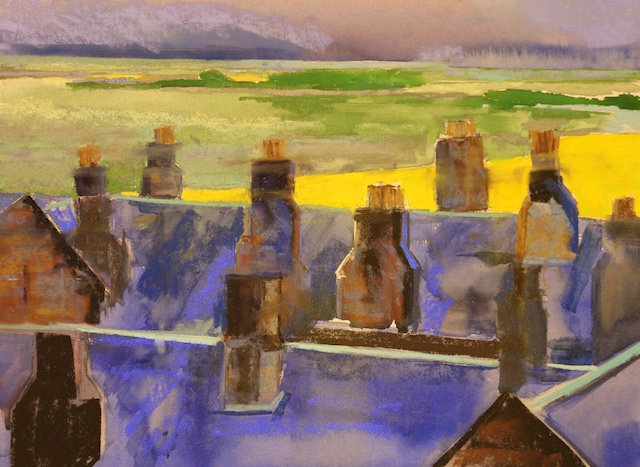
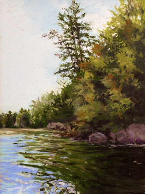
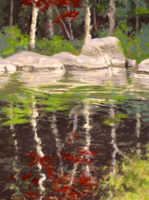
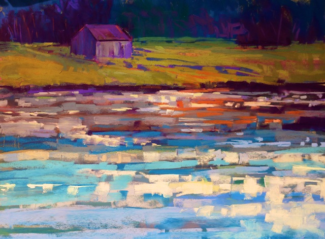
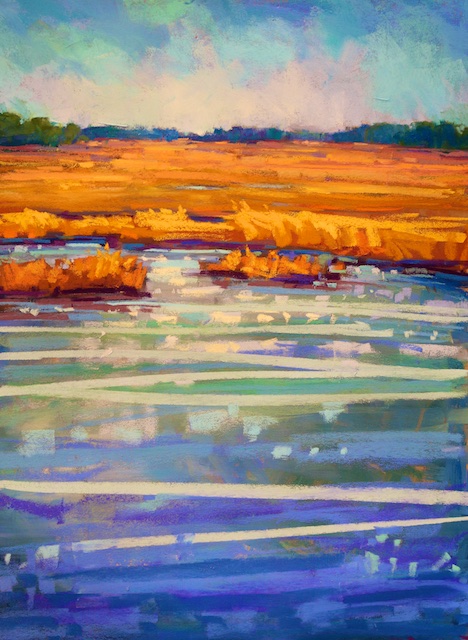
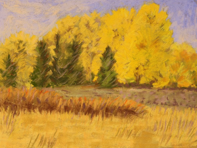
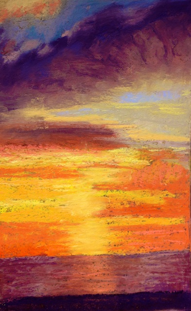
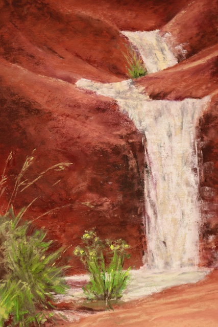
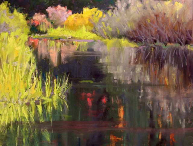
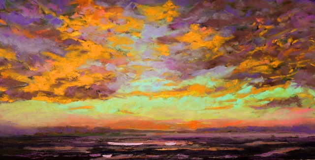
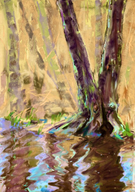
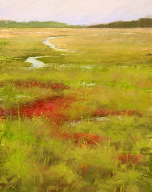
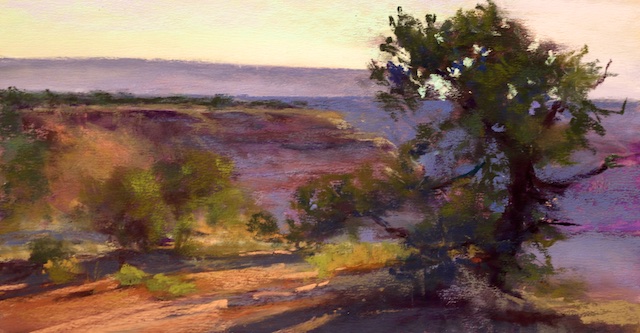
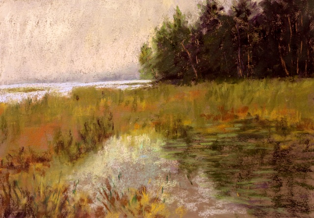
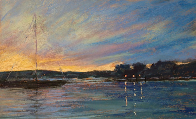
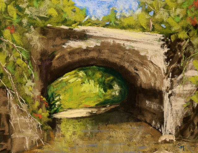
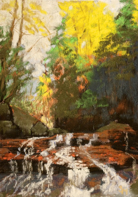
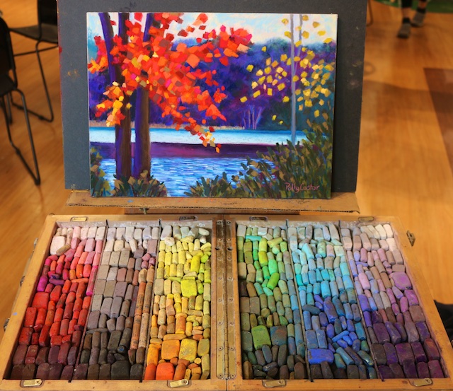
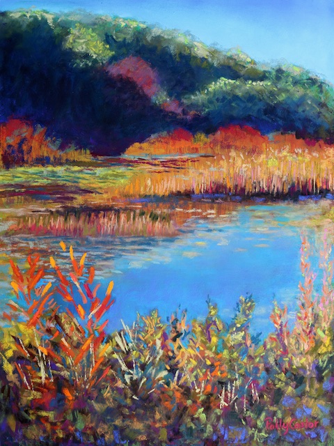
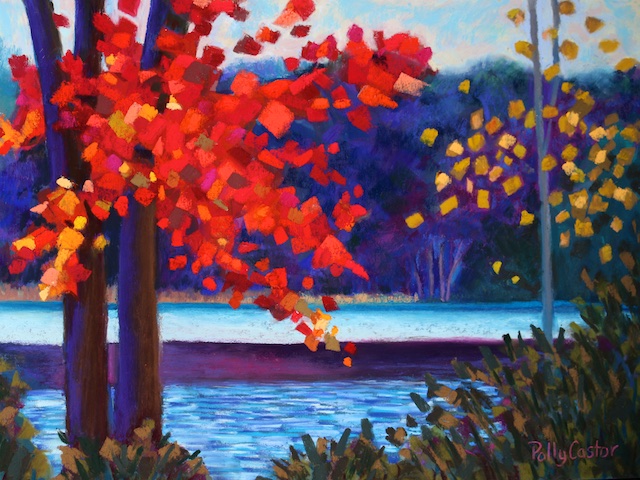
Below you can see gobs of photos of this workshop, generally in the order of occurrence. Of the paper cut-out exercise, mine are the first three, and the two finished paintings of mine from the workshop are shown last. Included also in the photos are Deb’s demos, lots of painters in process, and every painting in the final critique.
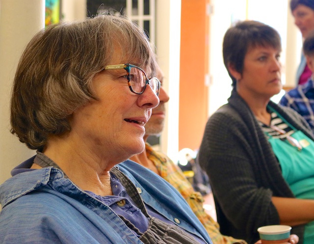
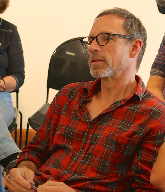
Participants in this class were very accomplished, as well as a joy to be around. We bounced ideas off each other and encouraged each other. What lovely people I hope to get to know better.
I took notes during the workshop so will try to do the content credit by enumerating it all here below:
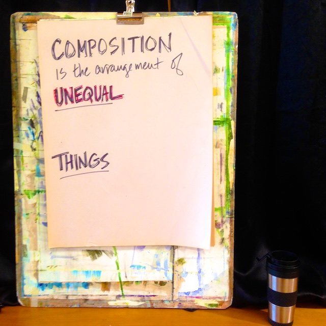
- Composition is the arrangement of unequal things. We arrange shapes, values, and colors. We do this “unequally” –ie NOT 50/50, or 33/33/33, or evenly– so as to bring more drama, interest, and energy. The things we are arranging unequally: shape, texture, color, emotion, value, line, edges, strokes. We want 80/20 of all those things for the most interesting composition.
- Examples: 80% mid tones, 10% dark, 10% light. 80% big shapes, 20% small shapes. 80% neutral, 20% intense chroma. 80% warm tones, 20% cool ones. 80% curvy lines, 20% straight lines. Skies 80/20 clear or cloudy; water 80/20 dark or foamy. Vary the size of strokes 80/20. Vary the direction of strokes 80/20.
- Something has to be dominant in every category, something else the supporting cast. In each category, what is the “academy awards best actor,” and what are the supporting actors?
- Work out all these 80/20 design relationships before you start to paint.
- Is your painting saying something? Many do not. Is it a good painting or not? It’s got to say what you want it to say, and if it does, it will touch someone else.
- “You’ve got to make a mark somewhere, it might as well be in the right place.”
- “Color dresses up a beautiful painting.”
- Shape of paper is a choice too. Oblong is calming, etc.
- Try cropping photos in different ways to see what is most pleasing.
- The more diagonal the line the more energy and the more drama.
- To make your greens look more real, knock them down with red, brown, or orange.
- Practice making certain marks. Timid and uncertain marks are tell tale signs of an amateur. Be bold and brave; the risks will be worth it.
- Three parts of your work: you, the painting, and the viewer. Don’t resolve the painting so much that the viewer has no part in it.
- How can you tell whether a yellow is warm or cool? Yellows that have more white in them are cooler, yellows tending toward orange are warmer.
- Watch that your clouds are light and airy enough to stay in the sky.
- Keep your darks really dark.
- If something doesn’t need to be in the painting, don’t put it there. If in doubt, leave it out. Only put in what needs to be there.
- Try a fan brush for underpainting grasses.
- Phthalo blue mixed with quinacridone red makes a good watercolor mix for high up in a sky underpainting.
- There should be a temperature shift between high up in the sky and lower.
- Make your under painting slightly darker than your finished painting.
- Bungee cord your pastel box to your easel.
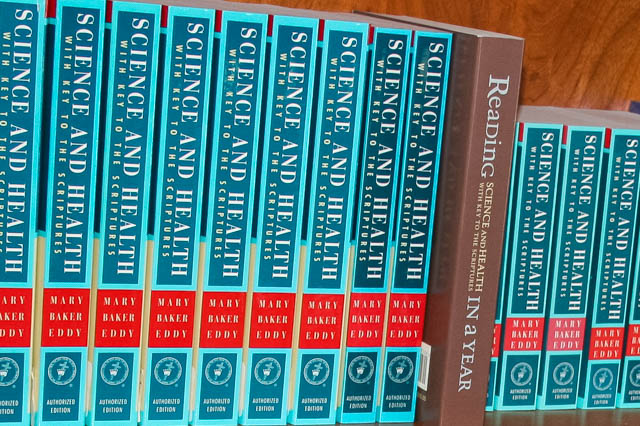
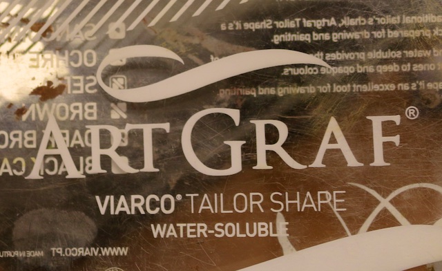
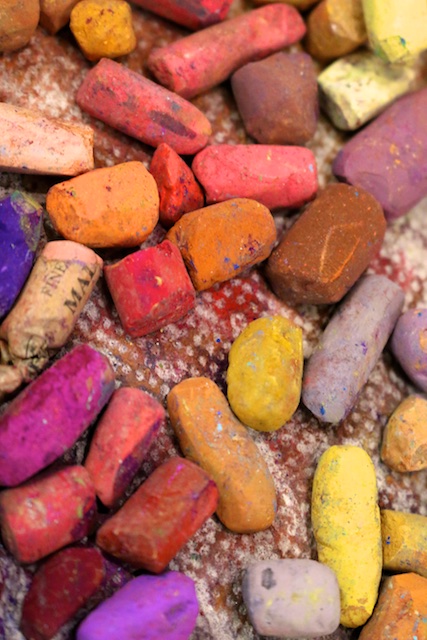
- She prefers watercolor underpainting to alcohol, which can get gummy on certain papers. She leaves a lot of the underpainting showing. Watercolors fade though, so UV glass and not placing them in the sun is recommended. Also try soluble graphite for underpainting (photo of the brand below).
- “The lightest dark should be darker than your darkest light.”
- Questions to ask yourself as you choose sticks of pastel to apply: lighter/darker? warmer/cooler? Background should be lighter/cooler, foreground warmer/more intense. Bolder strokes in the foreground, softer strokes in the background.
- We are painting shapes, values, colors, not trees and water.
- Try using sharpened vine charcoal for the tiniest twigs and tips of trees.
- Don’t like an area of your painting? Use a toothbrush to scrape it off.
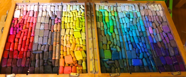
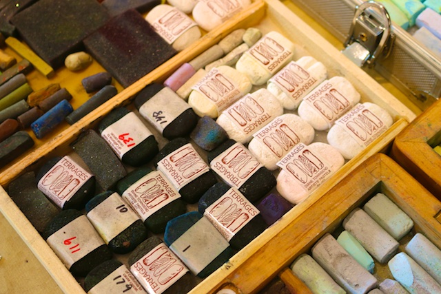
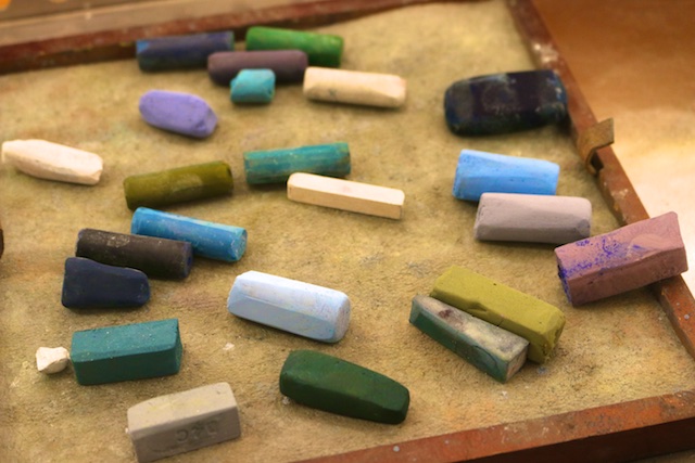
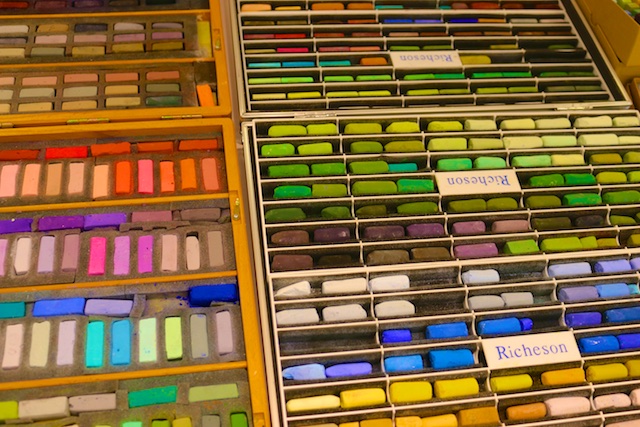
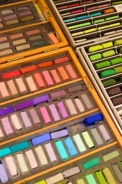
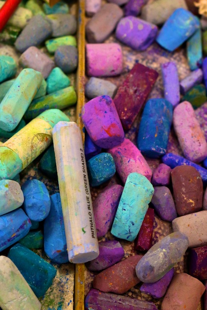
- For every pastel you buy, mark it down with its name, make, and number so you can reorder. Keep those records in sheet protectors in a notebook. Then take the wrappers off all your pastels so you can use them on their sides.
- Try mounting your paper on Gator board with Scotch 568 positionable mounting adhesive, available by the roll from Uline.
- Photos are problematic to paint from because cameras see differently than the human eye. Rely on your memory as well. If you use a photo reference, look at it and analyze what makes it work. Transfer what makes it work to your painting instead of just copying the photo reference.
- “Design is everything.” William Merrit Chase
- “Color does not add a pleasant quality to design– it reinforces it.” Pierre Bonnard
- “After you have designed the composition, everything else you do is merely execution– not that execution is by any means trivial, but virtuosity of execution is for naught if the composition is lacking.” John Gargano
- “If the basic shapes of a painting are not well designed and exciting, there is little purpose in continuing.” Jane R. Hofstetter
- “Design is not what it looks like and feels like. Design is how it works.” Steve Jobs
- “A designer knows he has achieved perfection not when there is nothing to add, but when there is nothing to take away.” Antoine de Saint-Expuery
- Artists/workshops to check out (discussed by participants): Sally Strand, Jacob Aguiar,Marla Pagetta, Robert Carsten, Wethersfield Academy of Arts, Ludmilla Gayvoronsky
Phew! Check out all the photos below of three days well spent. And thank you Deb Quinn-Munson!
–


8 Comments
-
Polly, what a photographer, writer, note taker and artist you are! Thank you for taking the time to not only keep track of everything in the three days, but for recreating the feeling of being there. It was certainly a fun workshop for me. I enjoyed, and was amazed by, the talent and warmth of the group. Thank you again, Polly!
-
Author
Thank you!!
-
-
Polly,
Thank you so much for taking the time to put all this together! I don’t have to try to read my scribbles now!
Your photos are spectacular! -
Thank you, Polly! What a great job you did putting this together in such a cohesive way. It was a truly wonderful experience. Also good to see old friends and make some new. Deb is a terrific instructor, and the group freely shared information and supplies.
-
Polly thank you so much for a great job putting Debra’s workshop in your blog. You really put it all in great order and I will certainly refer back your notes. It was a pleasure to have the opportunity to meet you. Again, thank you!
-
Looks like it was a great workshop! Thank you for sharing with great photos and notes!
-
Wow my friend, what an all inclusive infofest for such a special three days of sharing. You are amazing and your notes and pictures will be saved in my computer as well as my heart. Just to look at it all brings the good feelings as well as much of the knowledge gained . It was so great to see many faces I knew as well as the new ones I will remember. Thank You Polly for bringing it all together! Deb you are the best and Deb T thanks again!
-
Nice job on the blog of our delightful workshop Polly!
