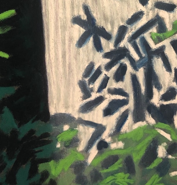
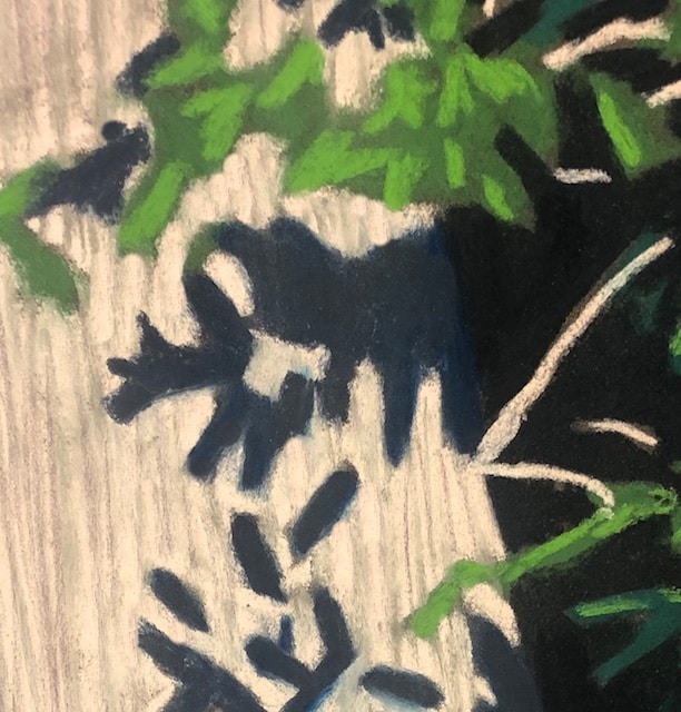
I enjoyed this limited palette value study.
They always say, “color gets the credit, but value does the work,” and its true. It’s always successful to base a painting on value (i.e. the contrasts between light and dark) first, with secondary emphasis on other design elements.
This painting shows that you don’t have to go far with color for the painting to be effective. The strong contrast, the interesting broken line mark making, and the diagonal design element bringing energy to the piece, all make it resonate.
The leaf shadows on bark are something I enjoy noticing, but have never painted close up before. I’m so glad I did.
This painting is 12’x16″ and done in pastel.
You can purchase the original here.
Prints and merchandise of this image are available here.
See the entire image above and two close up details below. I love how the close-ups each work too as strong abstract compositions.
2 Comments
-
Black is the queen of all colors.
-
Striking work of art, Polly! I love it x


