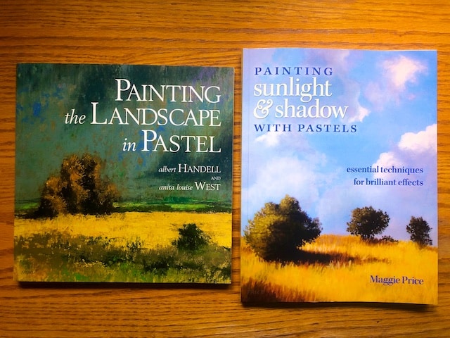
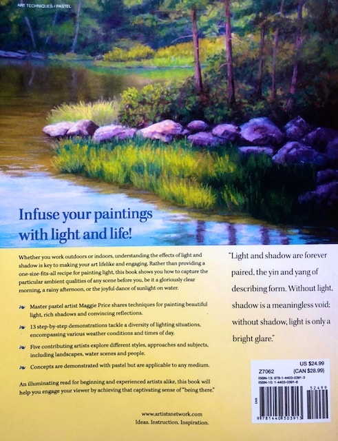
These two books are written by well established landscape painters in pastel. Many of the current pastel landscape painters stand on the shoulders of their teaching as workshop instructors. Knowing this, I bought their books many years ago (Albert Handell’s was published in 2000, and Maggie Price’s in 2011). Subsequent to buying them, I’ve met them and seen their paintings first hand, but I had not yet read their books. Given the sheltering in place edicts, I’m delving into my unread art book pile. I’m partway through many, and these are the first two I’ve completed.
First I’ll say, I was not universally overwhelmed by the quality of painting in them. The pastel medium has come a long way in a decade, as students of these people and students of their students compete for placement in national and international shows. The Handell book is illustrated with all his own work, but Maggie Price’s book, shares her own as well as the work of her contemporaries, who I feel have vastly improved in the meantime. Regardless, there were some notes and tips from these books that I thought were worth setting down and sharing with you.
Before I do that, I’ll also say that I do not find demonstrations particularly helpful, either in person or in books. There is, in my opinion, no better way to learn than experimenting and applying concepts yourself. Because Maggie Price’s book was sprinkled with so many demonstrations, I preferred Albert Handell’s (and I liked his paintings better too).
Most of these ideas were not new to me, but I liked how they were expressed. Here are what I thought were the best tips from both:
From Albert Handell:
- “Two complimentary colors mixed together in equal proportion result in a brownish neutral gray. With experience, you can learn to achieve subtle variations of neutral gray by blending complementary colors. When mixing two complementary colors, you want to avoid a “muddy’ result by making sure to keep the colors close in value. Suppose you are mixing yellow, a light primary color, with its compliment, violet, normally a much darker color. To yield the desired color, find a light tone of violet, one that is the same value as the yellow… Complimentary colors can strengthen each other visually because of contrast. But sometimes, the contrast can be too great, and you will need to harmonize the colors, such as with a red barn and surrounding green foliage. In this case, you can slip some red into the green foliage and some green into the barn.”
- “It is the combination of light-value and dark value colors that creates the illusion of depth and volume. In a painting where there only middle values are used, it is difficult to show how a form turns.”
- “Soft and hard edges give paintings another dimension of contrast. If two colors touch each other and the edge between the two colors is difficult to discern, or ‘lost,’ then the two colors are very close in value. On the other hand, if the edges between the two colors has a sharp line, a contrasting edge, then the two colors are different in value. Soft edges are especially important in landscape paintings, where distance and aerial perspective are necessary to show depth.”
- “It is advantageous to work lighter colors over darker colors. A light color over a dark color stands out, whereas a dark color over a light color appears dull. It is also effective to paint warmer colors over cooler colors, because it optimizes the effect of warm colors advancing and cool colors receding. Warm colors not only come forward, but also tend to rise and cool colors not only recede but also tend to descend.”
- “If you were to take a pure yellow and mix it with a gray of the same value, its intensity would be reduced, but its value would remain the same. This would be true of any color mixed with a same value gray.”
- “The blue sky lends bluish tints to shadows.”
- “The lower you place the horizon line, the more it will appear to recede into the distance.”
- You can soften a painting or lift up pastel that has been laid down by using a chamois. It wipes off large areas of pastel easily.
- “Skies can range from blue to gray to purple to green. No matter what the colors are, try to see where the colors are close in value. This helps to keep the sky from becoming too dark and losing its luminous quality. To decide what color to use for the sky, place the color, say blue, next to a color somewhere on the ground plane. In this way, you can determine whether or not the colors are close in value. A common misconception about the sky is that it is always the lightest part of the painting. This is not always true. On a sunny day, the lightest colors can be found in the sunlit areas of the landscape.”
- “Before you begin to paint clouds, observe which ones are the darkest and how they compare in value with the colors of the other clouds. Always begin by applying the color lightlyFollow the rich blues of the sky with the dark grays of the clouds, see how close in value they are, soften their edges, and then establish the whites of the clouds. This adheres to the strategy of painting light over dark. Start by painting the largest clouds first. Also start with the clouds closest to you in plein air they will shift more quickly than those in the distance.”
- Sky holes are gaps between tree branches that show the background sky. “Further from the center, where the foliage is less dense, the sky holes are larger, and are painted with a lighter sky color. A more intense sky color is reserved for the sky holes at the edges of the tree and for the sky itself…. Use different colors in the sky that are of the same value. This keeps the sky from reading as a single plane.”
- “Reflected colors of the sky in still water are not as bright as the actual sky. Whatever is reflected is usually more intense in color than the actual reflection.”
- “The movement of water is important. In order to capture it, I allow my strokes to follow this movement.”
- “Many other colors other than white are often used to paint snow. These colors reflect certain light conditions. To capture the light of an overcast day or late afternoon, add grays, mauves, and touches of blues to the white of snow. Also, snow gets darker as it recedes. So use the lightest tints of white in the foreground, and mix cooler, slightly darker colors into background snow. Adding dark, cool cast shadows next to the whitest part of the snow can make it appear brighter.”
From Maggie Price:
- “It is a good idea to work from background to foreground with pastels. This insures that each mark you make lays down properly, with foreground marks over background marks.”
- “Before you think about color, think about value.”
- “Warm colors appear closer to the viewer, while cool colors appear to be farther away.”
- An interesting contrast of dark and light areas serves as the foundation for all composition.
- “Instead of white, try creating the impression of white with very light values of color such as yellow, pink, orange and even green or blue. By using more than one of these colors and laying them in adjacent to each other with short strokes, you are sure to create some luminous whites.”
- “Take time to observe the color of a black object appears to be rather than just relying on your knowledge that it’s black.”
- “If you want to make a specific color appear cooler, consider warming up the colors around it.”
- “The color of an object in shadow is the same as it is in light, only darker.”
- “A cast shadow is darkest near the object that cats the shadow and becomes lighter as it moves away.If you paint a cast shadow with only one value, it won’t ‘lay down’ properly. To solve the problem, use several values, with the darkest value closest to the object casting the shadow, getting progressively lighter as the shadow moves away. The number of values you will need will need will depend on the length of the shadow.”
- “A good rule of thumb is to paint only half as many sunspots as you see.”
- “As a general rule, light values tend to reflect a little darker, while dark values may reflect a little lighter.”
- “Questions to keep in mind to help insure your success: What is my range of values? Is the distinction between sunlight values and shadow values clear. What is the color and temperature of the light? What is the direction or angle of light? Are the shadows crisp-edged and sharp or softly diffused and subtle? What color are the shadows?How do shadows help describe the form upon which they are cast?”
I’ll be reading some oil painting landscape painting books next. Hope you found these notes helpful!
Related Articles

1 Comment
Pingbacks
-
[…] 2. Painting the Landscape in Pastel […]


)