–
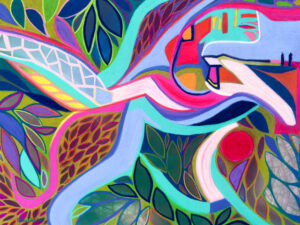
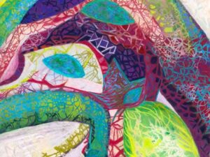
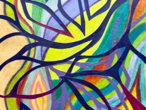
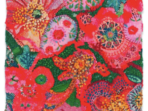
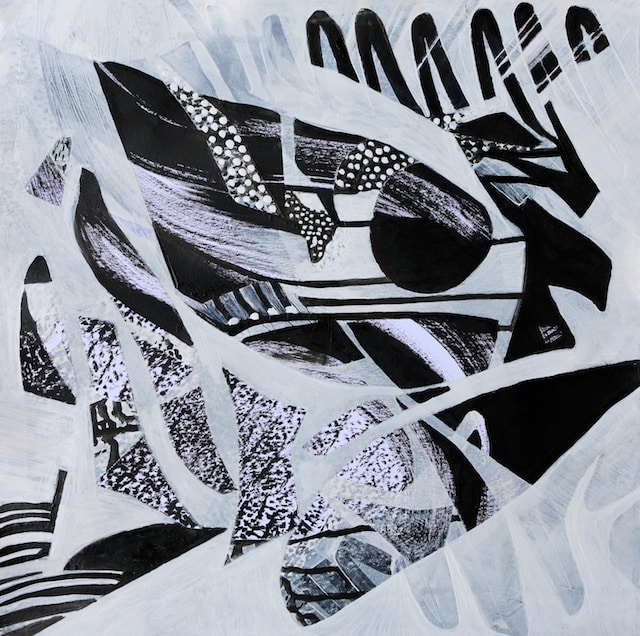
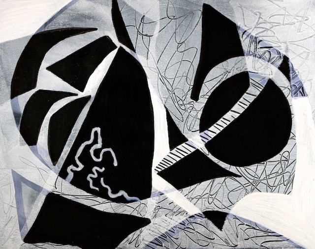
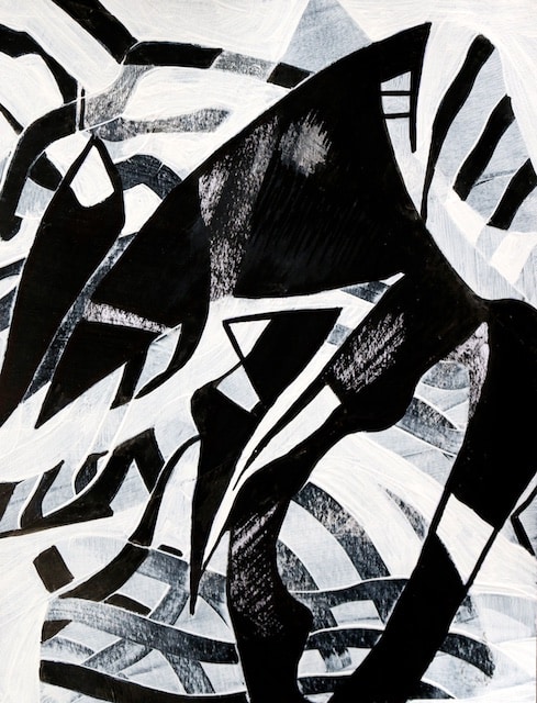
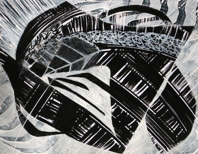
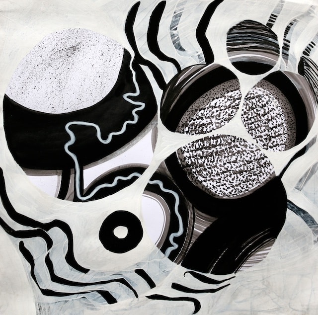
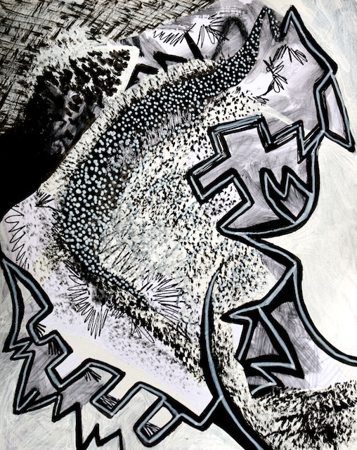
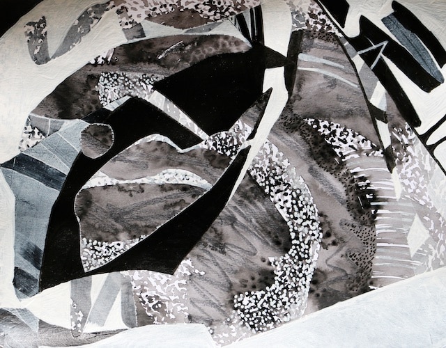
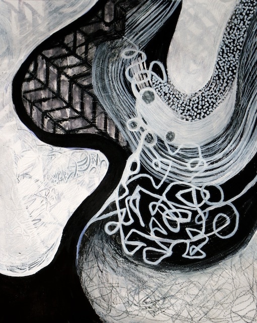
I’ve been continuing this black and white series from the last month (see here, here, here, and here) and think I probably only have one more week of exploring this before I need to move on to other things. With these projects, I am prepping for my Monday Morning homeschool high school abstract art class, where we are going to start next week with making abstracts in black and white.
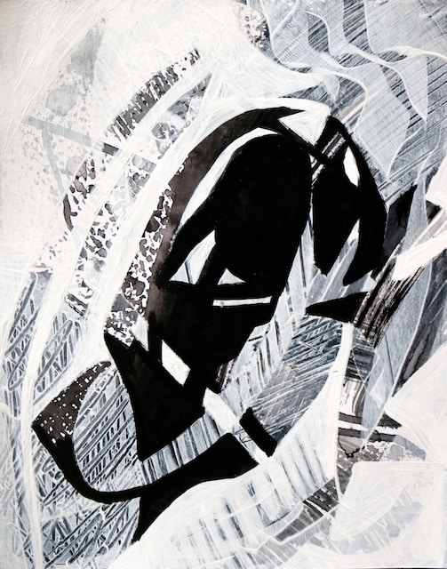
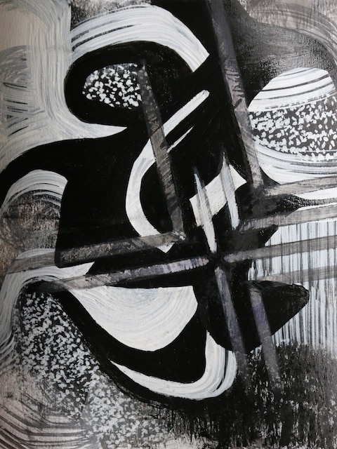
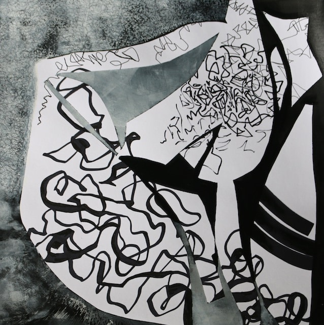
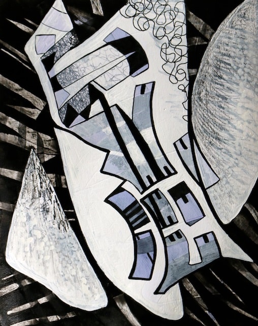
This time I did not use collage, stamping, or printing, which you all know I enjoy. I have also limited the use of repetition as a design element here, hoping to give the pieces more of a sense of tension and release. I have been considering if “balance” is always a good thing in a composition, and here have tried not to have them too balanced, to avoid them feeling static or boring. I have not used any “gray” at all and any grayish elements you see here are done with either texture or veiling.
In the pieces in this post, I have instead been experimenting solely with black and white acrylic paint, ink, graphite, crayon, resists, alcohol, water, and glazing mediums. I am playing with shapes, lines, and patterns and the comparative density of those elements. I’ve been considering how much value contrast to use, and what distance shapes and lines should be from each other (as well as from the edge of the paper). I’ve been utilizing a variety of scale and texture, and questioning what achieves depth and a sense of kinetic motion. I’ve tried for these pieces not feel too symmetrical or predictable. I’ve been listening to the conversation between opacity, transparency, or veiling. I’ve been pondering what feels full in a composition without being too busy, and also what composition breathes with a sense of space, without feeling too empty, simplistic, or vapid. I have tried 12 different ways of starting out, thinking carefully about the impact of the various starting points have to the end result.
I am honing what I prefer most, not only intuitively, but specifically. I’m trying to put language to what feels unified and satisfying visually to me, both for my own understanding and progress as an artist, as well as being able to explain it to others. Art for me is so spiritual and deeply intuitive, I’m trying in these to explicitly break down elements into ideas, that become not only a menu of variables to choose among during the art making process, but vocabulary to define and explain these things for myself and others.
The square ones are larger (15″x15″) and the rest are 8″x10.”
–
4 Comments
-
Polly these are magnificent!
-
Author
Glad you like them! That means a lot!
-
-
So beautiful! I’m not usually a fan of black and white, but these are captivating.
-
Author
Oh, thank you! You know I totally love color too, so these have to have some reason for being without that delightful element!
-
