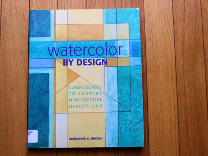
I really liked this book and have gotten good ideas from it. I give it five stars as it is more helpful than a lot of similar books. Mostly it outlines the twelve classic design motifs which I’d like to discuss soon on a separate post. (You may have already seen the beginning of my examples of these on my box-a-day post two days ago.) I am doing black, white and gray collage examples of each motif in my box-a-day art journal. This has been a helpful exercise. Below are the other ideas of particular merit I found in this book. Basic Design Principles:
- Variation of sizes shapes, textures, colors, and values adds diversity
- Repetition of shapes colors and line creates rhythm and balance.
- Dominance of a warm or cool palate helps establish continuity
- Contrasting adjacent values – light-to-dark or warm-to-cool – adds interest.
- Harmony results when shapes, colors and directions are similar.
- Center of interest is established with a shape, color, or value contrast that catches the viewer’s eye.
Watercolor Technique tidbits to try:
- Transparent pigments can be lifted easily where opaque pigments cannot.
- If you want to depict atmosphere and light, use non-staining colors [nothing titled Phthalo or Winsor]. To express mass, weight, power and strength, use opaque or staining colors. [Try having areas of both in each painting.]
- Ruling pens are designed to make straight lines with ink, but you may also fill the pen with watercolor paint. When doing so, be sure that the nibs are close enough to prevent the paint from running out; there’s a small screw on the side of the pen for adjusting the nibs. Then fill the pen by wiping a paint-filled brush between the nibs. Practice on a spare piece of watercolor paper to perfect this technique. Clean and dry the pen when finished. [You can also use masking fluid in a ruling pen, to protect areas you wish to stay white!]
- If you prefer to paint seated, with your watercolor paper lying flat on the table, place a clean bath towel under your painting. It will absorb excess water and paint and prevent run-backs.
- Foreground shapes painted in light values will pop out distinctly against a background of dark values.
- Payne’s Gray is valued by many watercolorists as one of the most useful paints to have on hand as a component in building interesting, colorful neutrals.
- [Try placing] your checkerboard grid inside another shape.
- Draw grid lines with crayon to act as a resist to your watercolor paints. [Prismacolor pencils also have an oil base that repels watercolor! Try a white one.]
- [When working on Yupo paper] paint can slip. To prevent that, [use] a hairdryer on the paint before [it can] slide around.
- Try these variations: painted grid lines that stop and start; graded washes that change to fat washed along grid lines; soft edges that change to hard edges along grid lines.
- Try coating your paper with any of these water soluble products: monotype base; gum arabic; liquid starch; thinned pure liquid soap; a permanent coating of acrylic matte or gloss medium; or white glue. Thin the permanent coatings and try using several layers. Paint on wet or dry coatings; rinse brushes well. These coatings will make it easy to lift color off dry or wet paper with a wet bush, sponge or tissue.
- Steeper more slanted diagonals evoke a more active feeling in a staggered design, as opposed to the calmer feeling that slight diagonal relationships confer.
- When masking off an area to reserve white paper, press the tape down firmly with the edge of a fingernail to prevent paint from leaking through when applying washes in areas between the pieces of tape. Warm the tape with a hair dryer before pulling it off.
- [When using salt for textural effects] some of the paint color will be absorbed into the dried salt. Save it and use a second time; the remaining color will melt into your next wash! Try different kinds of salt.
- Try stamping paint with styrofoam “popcorn.” Also try sticks or bubble wrap.
- In planning a cantilevered design, the most important thing to remember is that the focal point should be in the projecting shape. Paint new or brighter colors, more detail, new shapes, or greater contrast to catch the viewer’s eye.
- As a general rule, larger shapes tend to float forward more than smaller ones. What happens if you paint larger shapes with receding colors and smaller shapes with bright eye-catching colors?
- [Once entire surface of paper on top of the towel is wet apply the washes.] To control those washes so they stay where I put them, I cleared my brush of excess water by patting it on a tissue before I picked up the paint.
- [When I want to do another layer of wet-in-wet] I ran water evenly over the entire front and back of my paper under a faucet. Soaking watercolor this way does not damage previous layers of paint. With excess shaken off, I placed the paper on a towel again to saturate it evenly. [You can do this multiple times if throughly dry between.]
- [If the paper has buckled because you wet and dried areas separately, flatten the paper by wetting] the back of it completely and place it face down on a dry town with another one on top between two boards, and let it dry. If the paper isn’t completely dry it may buckle again. Check it by touching it with the side of your hand. It will feel cook if the paper is not completely dry.
Give this a try if you are either a beginner or a veteran; it can jump-start your art!

Related Articles
1 Comment
Pingbacks
-
[…] the book I reviewed yesterday (see here) I studied the twelve “design motifs.” I enjoyed doing one each day in my Box-a-Day art […]