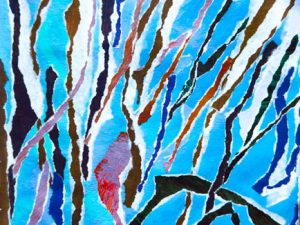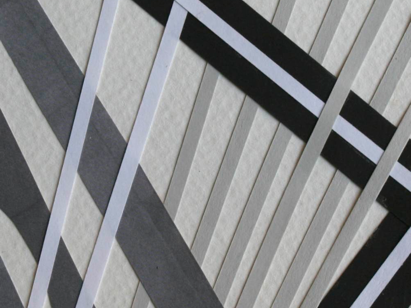
In the book I reviewed yesterday (see here) I studied the twelve “design motifs.” I enjoyed doing one each day in my Box-a-Day art journal. There are lots of possibilities here!
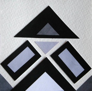
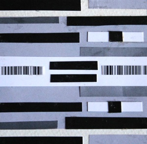
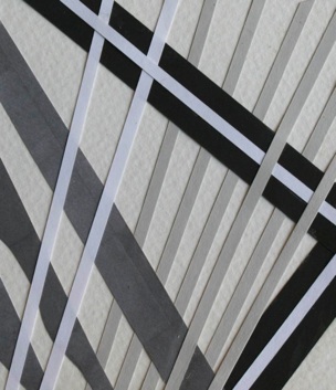
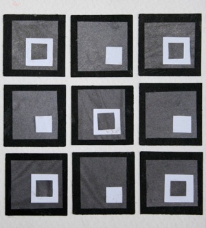
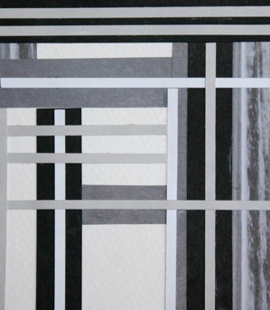
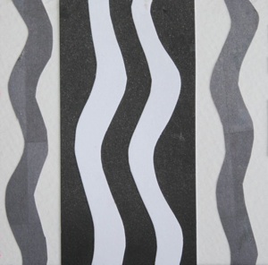
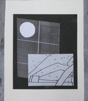
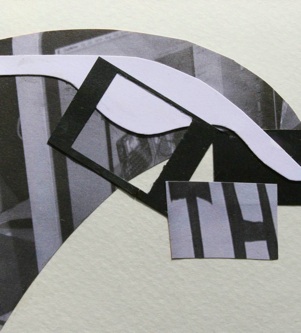
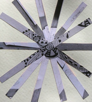
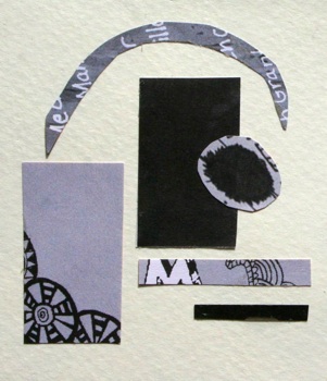
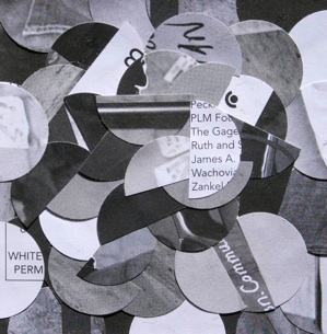
To simplify the concepts, I chose to do a black, white and gray representation of each done in collage. This was fun. There are many jumping off points from here when you involve color or other media, let alone the endless ways to go within each motif even with this black and white method.
This has been a worthwhile exercise and I recommend it. It would make a great format for an art class, or a wonderful project for homeschoolers. Have some fun and widen your world by exploring these design basics. You’ll start to see them everywhere!
The Twelve Design Motifs are listed here with my representations below in order:
- Vertical
- Horizontal
- Pyramidal
- Checkerboard
- Asymmetrical Grid
- Staggered Grid
- Frame-in-frame
- Cruciform
- Cantilevered
- Radial
- Floating
- Overall
1 Comment
Pingbacks
-
[…] (The black and whites are part of a design series I worked on and those close-ups have already been posted here.) […]

