–
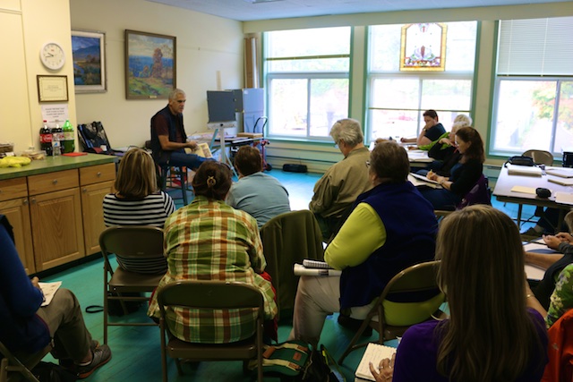
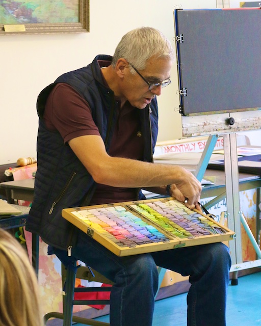
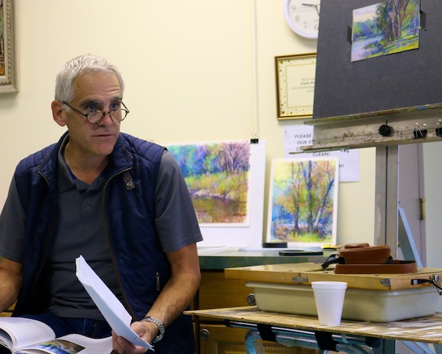
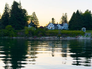
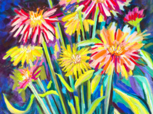
It was a major privilege to take a week long pastel workshop from one of the leading artists in the field, Richard McKinley. (He has work hanging in museums next to Wolfe Kahn, and some collector he’s never met, a lawyer from Philadelphia, for example, has bought 37 of his paintings, etc.) Not only is Richard an amazingly talented artist, he’s a nice guy and a good teacher too. Below you can see the notes I took for the class, preserved both for my reference and yours. Additionally, you can see photos of the class here and here, as well as see what I painted in the class here and here. Eventually I will post photos of the demos he did for us, as I photographed them step by step. So in no particular order:
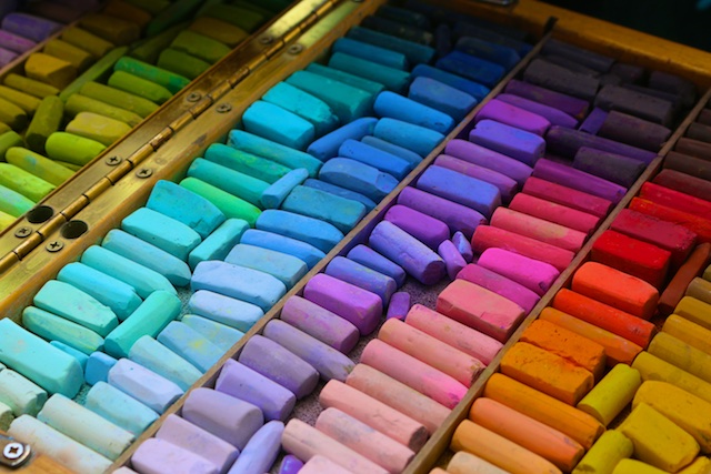
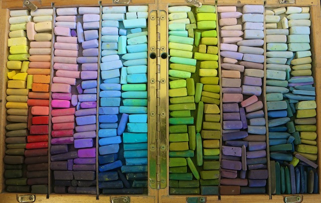
- Here was our supply list where you can see the pastel brands he likes, as well as recommended plein easel set ups. He recommends the darks and grays in the harder pastel sticks, and the lights and brights in the softer sticks. I learned that NuPastels are prone to fading–especially the reds– so they would be avoided. Brushes he likes: cheap synthetic Princeton Snap Flat brushes; he says avoid the brights (brush shape). Get Ph neutral drafting tape, and three value ink pens. Try Pastel Premier’s Italian Grey color; he thinks it is great, but like white too. White paper is luminous and can glow from below on thinner application, whereas toned paper is just a harmonious base, but does not glow. Get paper mounted on museum board at Central Art Supply. Fixative is not a necessity, but he uses Lascaux on occasion. Grit on a sanded surface: the higher the # the lower the tooth, or the lower the # the higher the tooth; he recommends 400. Only one rule: ARCHIVAL.
- Tip your paper so it is parallel to your gaze.
- Paint with the pastel, don’t draw with it.
- If you are sitting at your easel, sit so your right shoulder is toward your painting. It will give you more ease of movement and better simulate the gestural arm motions possible standing upright.
- Use a Gator board substrate to tape your work in progress on, and then get two Gator boards the same size as each other but larger than your than your painting and clip it together like a sandwich for carrying purposes. Paint on black Gator board outside (for less reflection next to your painting) and white inside to give you as much light as possible.
- When painting outside in full sun remember that it will look much darker inside. Shadow the painting some when working in the sun to see what it will really look like.
- Work thin to thick, dark to light, dull to sharp, soft to bright.
- When you block in a dark mass at the beginning of a painting, don’t make it darker than value scale 3, because you want to add darker accents.
- Separate theories from techniques! Use theories to produce techniques.
- Three basic theories: Simultaneous contrast, atmospheric perspective, and areas of interest. We put these ingredients in our painting and then start manipulating it.
- Simultaneous contrast is a term coined by a Physicist who said, “Nothing is what it is until it has a relationship.” It is all about relationships. Things look different in relationship. A highlight on the green trees would be the darkest point in the clouds. What you put in your painting is what you want people to believe. If you try to paint it “just like it looks” it won’t work. Be a magician. Saw the lady in half. What is happening is shapes, edges, values, and colors. Manipulate these because it is a performance. When anything is in a warm situation, it is going to appear cooler. You are creating a “situation” in your painting. How pure or gray should your color be? And absolute black does not exist in the landscape. So beware of the human visual response to the way our eyes respond to color in juxtaposition. Scatter and shatter light.
- Atmospheric perspective is also called arial perspective. Even if you don’t see it in front of you, do at least one of these things to create atmospheric perspective: cooler in distance, lighter in distance, grayer in distance, more blurred in distance. Foreground should be brighter and warmer to bring it forward. As blue recedes, it becomes more silver-like. Without light there is no color, that’s why color shifts occur. A painting is a magic show. Having it look like what is in front of you is not good enough. Eyes see, but the mind is mostly what is going on, so beware of your educated prejudice that of puts in eyelashes where you can’t actually see them. Fuse together a compromise of what you know on the one hand and see on the other. Every painting is a series of compromises, so even though the shadows across the lake look darker, paint them cooler, but not darker, to make it look farther away. Color is reflected light, so concentrate on what the light is like, and what it is doing to surfaces.
- Focal points, or centers of interest are actually more accurately areas of interest. It is not a thing (the barn, the bird, etc) but a place where those things exist. So consider what you do in that place. Contrast brings you to the focal point, and the way to create contrast is through edges, values, and color. Find the visual flow in the painting. Where do you want the eye to flow, and where to you want them to pause? The consequence of details is that it takes away from other areas of the painting. Try to have your details at your focal point. Have one main focal point and develop that “character” in the story more. There are other “characters” (secondary focal points), but the main character should be of most interest.
- When painting a field sketch make being there more the point of the painting. Look at the scene and identify the value and color. What can you capture that the camera can’t give you? Photographs give you detail but in painting you see color relationships. Be spontaneous. Be there to see what is beyond the photograph. Be sensitive to the landscape and see real light falling on it. Don’t think so much as do. Be intuitive. Close to finishing your field sketch, put black tape around the painting and make any necessary adjustments. The black pushes it back a bit so it is easier to finish.
- The point of thumbnail sketches is to analyze abstractly. Break the scene down into an abstract design of light and dark. Understand that before you start. It’s like getting a good cake for you to enjoy frosting. If only the frosting is good no one will enjoy the experience of eating the cake. Block in all neutrals so you will have color harmony. Then fuzz it down by softening and diffusing the edges (a bit of pipe insulation is good for this on sanded papers.) 60% of this under-painted surface will not be covered over. Then finish by intensifying the colors. If you start with raw color, you are lacking underlying harmony. The quality or quantity of color has nothing to do with the harmony of color. Draw on your painting only looking at your thumbnail sketch.
- Know the difference between hue, value, and chroma.
- The darkest dark in the lights is the lightest light in the darks.
- Repeat colors around the page to create harmony. He calls it an “echo.”
- Get the “value viewer” app. Play with it making automatic notans before you paint as well as use it to check out your painting after you’ve painted it to see if the painting’s notan is as intended.
- Celebrate your mistakes because you tend not to do them again.
- Design elements: line, shape,, color, value, tone, texture, depth.
- Design principles: balance, contrast, movement, rhythm, emphasis, proportion, unity.
- Paint like you have all the time in the world to finish. You will make better choices, and you’d rather have made good choices to finish later than bad choices because you were rushing to catch it all on site.
- Cast shadows will always give you an idea of where the highlights are. So always start with them, because when they move, you’ll still be able to figure out where the highlights go.
- You are looking for movement of light and dark. It should not be 50/50. Either the light or the dark should be dominant. There should be a balance and a counterbalance. You are looking for a juxtaposition and pleasing abstract of dark and light (black and white in a notan).
- In plein air, look for things you can hold on to. Are there contrasts of shape, value or color? Then you have something to hold on to. When you are done, make sure whatever you are “holding onto” is dominant, and that you didn’t stray from that. Look for strong shapes. Is it front lit (light on it), rim lit (you are looking into the light), or side lit?
- Solvents: blue turpinoid or denatured alcohol will evaporate quickly but will soften pastel and become sticky. He prefers mineral spirits. Water also works but will wrinkle paper unless it is already fixed to a rigid board.
- Underpainting: do it in anticipation that you will let it show. Should I paint over it or keep that bit? Underpainting is a set up. The most important thing your underpainting can give you is VALUE. It has to be a value you can work with or it will get covered up. On a lighter underpainting you will be adding darks, on a darker underpainting, you will be adding lights. An underpainting is also a set up of atmospheric perspective. There should be foreground, middle ground, and background in your underpainting. Have no hard edges in your underpainting. Think of it as an out of focus photograph and you are slowly bringing it into focus. Sennilier has no talc in it so it is best for underpainting, and Holbein makes a set of water soluble pastels. Do the underpainting exercises in Richard McKinley’s book titled Pastel Pointers.
- Watercolor underpainting will require your paper to be mounted, but mineral spirits do not. Acrylics fill in too much of the paper’s tooth so don’t bother with trying them. When using watercolor for underpainting, start with the darks and do the shadows first.
- If you put pastel on that you don’t like, put some mineral spirits on it and dab it off.
- Play and experiment. Try new things. How do you know what underpainting to do? Because you’ve done it before. Don’t just say you don’t like Mexican or Opera if you’ve never tried them. You know you “feel like having Thai” because you’ve had it before. TRY THINGS and see what you like. Look for possibilities not roadblocks. For example, thin washes of oil paint with mineral spirits applied on it will get all spider webby .
- Do not care about getting every tree trunk correct. Stand in front of nature with authority.
- The “chalky look” is what happens when we “hop value.”
- Humans see at 1/20th of a second slower than a camera, so any time you are capturing something moving faster than that in a photo you actually wouldn’t see it. So if you are painting something like that, don’t paint it from a photo.
- “I go through all my little rituals so I can be loose.”
- Value does the work, color gets the glory.
- Don’t paint sections, paint over the whole surface.
- Add “McKinley sparkles” where you want the eye to go.
- Let go of corners. There should be a hint of a “visual egg” shape in the painting.
- In the fall, take control of warm and cool. Intensify the blues. In the warm colors, have just a few golden and the rest warmer tones, making them softer and diminutive.
- The secret of color harmony is purple/ green/ orange, the three secondaries on the color wheel.
- Shadows on water or concrete might be a solid line, but never in grass. In grass, break it up everywhere, not just in some places.
- Beware of regularity. If you have three evenly spaced trees in the distance, put a random trunk in somewhere to break it up. Let go of absolute tree trunks.
- Where a branch enters the leaves it is always darker.
- Play with sharp and soft edges. In linear shapes, move your pastel in the perpendicular direction.
- Don’t have a hurdle to get into the painting. Add shadows to “lead you in.”
- Let reference material lead you but not dictate to you. Don’t be a slave to reality. Why not build something dream-like and build reality on top of it? Example: paint yellow skies “because that is the temperature of the light.”
- Look for triangular motions in your compositions. Put in triangular conversations between texture, shapes, values, or color.
- Move between painting positive and negative space.
- Echo the green of the grass somehow into the cow that is standing on it.
- Work small when you go outside.
- Lavender can be a great shadow on sand.
- Fragment color all you want if you retain value!
- A good abstract is nothing different than representational work.
- Get to a certain point and walk away. If you work on it too much it will lose it’s spontaneous nature.
- Even adding a couple red dots in a green landscape to complete the color wheel will help make it more harmonious and help you move your eye around.
- Choose what you want to emphasize. Don’t let instruments overpower each other in the symphony. Pull the viewer where you want them. High horizon, you’ve got them looking up. Low horizon, you’ve got them looking down and feeling more connected to the earth. Squares have more tension. In a panoramic, we feel the vastness of the landscape. Play with the visual push/pull within a painting. Play with scale. Find beauty in the mundane. (His telephone poles and concrete steps are gorgeous.) Harmony is created in consistency; listen to the painting and commit to something and follow through on it. If you go to the honky tonk and flirt with everyone there, you’ll go home alone. So focus your energies, but remember everything in the same chroma won’t work. So lots of color with some less intense grey tones, or a grayish tonal painting with pops of color. For whatever your dominant color is, use adjacent ones to it on the color wheel, and maybe one dissonant one. Similarly, if I want a lot of texture in the trees, I need texture in the sky as well. If smooth trees, smooth sky. You can use texture to get their eye moving around the painting. But don’t flirt with all the guys. Choose what you are going for.
- The most important lines of a painting are the external edges of the rectangle of the paper.
- What we really see is bits and pieces that the mind finishes. Resist the urge to paint the whole line of a step on the stairs or clapboard on the house. Paint a sliver of light or a bit of texture. Go after pieces of light or shadow, hints of roofline, etc, instead of drawing it all in.
- White in light is different than white in shadow. White in shadow has a zillion colors in it.
- Bushes have a lot more shadow below and behind them than you might think.
- In the beginning it is about the scene. As the painting develops, it becomes all about the painting.
- Photograph the different stages of your paintings. Keep them to learn what you did that worked and didn’t.
- Look for the form within the object. Form in the light has a highlight in the bit closest to you. (You learn that by doing still lifes.)
- You can have all sunlight in your scene, but shifted planes still have different colors of light.
- Try working in a series: square (a format series), or a subject matter series (all clouds or cars, etc), or a subdued series, complimentary color series, etc. Submerge yourself in certain themes. You’ll learn a lot this way.
- Don’t try to justify what is there or what you are painting. That shadow behind the tree does not need to be either the sky or the hill behind. It can just be a shadow or what the painting needed. It doesn’t even need to be what you see. You are going to need to release what other people think they need to approve of your painting. Maybe they just can’t go there, but remember there are plenty of people who will appreciate it. In a gallery, half the people walk past one style to get to the other and vice versa. So it doesn’t matter if those you respect can’t justify something you’ve done, because others will. And don’t ever try to justify yourself. Your instincts will tell you the truth. If you like it, it is good.
- Signatures are part of your composition, so sign it where you need it as part of your composition. Sign with a pencil if the color/value is okay for that in that spot. Otherwise, sign in pastel pencil.
- Regarding framing: Frame with no spacers directly against the glass. This is fine because pastel is a mineral silica that won’t stick to glass, as long as you get it secure and tight so that it won’t move. Moisture is your curse. With spacers you have more opportunity for mold and mildew to be created. Additionally, the backing should not wick moisture. Use a mylar Ph neutral tape that doesn’t wick moisture. Avoid plexiglass because it is not rigid enough and will cause static. And always use “museum glass.”
- Shipping paintings: Use Fed-ex who will insure it (where DHL and UPS won’t.) Fed-ex also sells floating boxes for artwork. Go for 3 day air so it is bumping around less.
- Pricing: Give a higher price per square inch for smaller paintings, and a lower price per square inch for larger paintings.
- Check out Richard’s DVD on Composition and design. Read Arthur Wesley Dow’s book on Notans. Check out Jean Dalton’s fabulous abstracts. Read the book Strapless about Sargent. Watch the Mr. Turner movie on Netflix or Amazon. Oil Painters of America do a good blog. Read about Richard’s impasto technique. Read George Innes on the transcendental nature of light. Check out Richard’s mentor Albert Handell. Join the Madison Art Society. Read Bill Creevy’s book of every crazy technique (which is really all about permission). Spend time with Richard Schmidt. Get Carlson’s Guide to Landscape Painting.
- PSA = Pastel Society of America. All members are juried. There are about 1,000 paintings submitted for every show where 80 are accepted. Shows require 80% dry pastel so only 20% of alcohol, mineral spirits or watercolor can be showing on the visible surface of finished pieces.
- Put a gray scale next to the painting when you photograph it, to have an accurate photo to send to shows. Find a monitor calibration for your monitor.
- Legendary people struggle just like you. Everybody has good days and bad days.
- Don’t be intimidated. Paint shapes and paint essence, and think of it all as abstract.
- How do you know when you are done? When you’ve done too much! DaVinci said, “Artwork is never finished, it is only abandoned.”
- He has three piles in his studio. “I’m pretty sure I’ll finish it.” “I’m not sure I’ll finish it.” “It’ll probably die soon, but I’m getting some distance on it just in case I change my mind.”
- Look objectively at your painting to reevaluate it. What was your concept? How is your composition? (3/4ths of your success is in composition.) Look at the values. If it is not working it is almost always a value related issue. Is there color harmony? Is there an area where the eye can rest? Is there mystery? (Mystery is what really holds the memory and attention because it involves the viewer.) Your audience is not there, so without knowing what you know about the scene, can they tell what is going on? (i.e. Does it “read?”)
- Look at your paintings like children. You give them guidance and support but you have to let the kid do what it needs to do. Give yourself and them permission.
- Push atmospheric perspective.
- Understand edges.
- Do only what you love.
- Find the places you want to magnify.
- Transition from how to paint to what to paint.
- Pace yourself.
- Enjoy!
–
Related Articles
3 Comments
-
Thank you for this….I absolutely love reading it!
-
Yes thank you very much. I am new to pastels and just love painting with pastels . This article has been very helpful. Where would I look to find out about upcoming pastel classes. Thank you, Jeannine Hammersley
-
Author
Pastel societies are a great way to learn about pastel classes. So is the Pastel Journal.
-