Landscape Painting Inside and Out (Book Review)
1 Comment
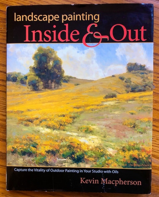
I have now studied this book carefully and it was worth my time. If you have an interest in painting, even if you don’t paint in oils, I recommend perusing this book. The fundamentals he discusses apply to all kinds of art in general, even my abstract work. I give Landscape Painting: Inside and Out five stars.
I took copious notes from this thorough book and have copied them down here, both for my reference and yours. Some notes are reminders of concepts, others are ideas to try:
- Painting is a study of relationships.
- Remember to simplify. How can you arrange the shapes?
- Design major shapes as values. (If color was stripped away it should still be understandable?)
- Color harmony is automatic when you use a limited palette.
- Try a limited palette of 3 primaries plus white.
- With complimentary color, making one “less pure” with a bit of the other in it will have the two exist together more harmoniously. For color harmony start with one primary and mix it with the other two primaries. This way everything in the painting has something in common.
- Look for contrasting colors in the shadows (yellow object/purple shadow; red object/green shadow)
- Paint your purest color note first, then key the rest of the painting to that.
- Refine shapes with temperature changes not value changes. All the colors in a shape must have the same value.
- Intense color surrounded by neutrals will attract as much attention as a contrast of compliments.
- When you mix a color, ask yourself if it needs to be lighter, darker, warmer, or cooler.
- Compare your edges just as you do color. There is a hardest edge and a softest edge.
- The more contrast of value or color makes for a harder edge. Reducing the contrast softens edge. If you want to soften an edge, mix up a pool of each shape color then mix them together to make the transition between the shapes softer and more gradual.
- Identify your extremes: smallest/largest shapes, most intense/most neutral shapes, lightest/darkest value, sharpest /softest edges. Then relate everything to the extremes and live with them.
- Remember there are two ways to adjust any relationship. If something reads too warm or hard edged (maybe it doesn’t need changing but maybe something else needs to be changed).
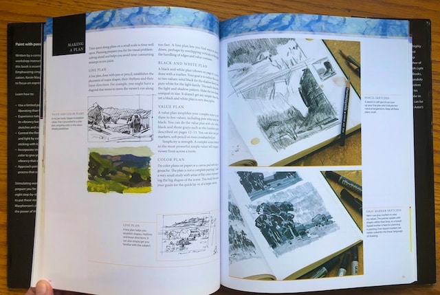
- A good painting starts with an idea. What made you want to paint the subject? What do you want to communicate about it?
- “Design” is the series of decisions you make about space, color, size, texture, edges, lines, and direction, in a way that supports the main idea.
- Simplicity is strength. A complex scene reduced to the most powerful simple values will engage a viewer from across the room.
- Before you start to paint, write down your feelings about the subject. Then make you choices to best reflect your feelings.
- Divide your scene into light and shadow. Then start by painting your darkest dark. Then paint your lightest light. Add values into your darkest dark. Then add other light values. Work whole to parts.
- Using a too small brush will cause you to think about details too soon. Use the largest brush you can.
- Paint small so you get more experience. Growth comes from lots of experience.
- Set up your plein air canvas and palette so it’s not in the sun. If in the sun, your resulting painting will be darker than you want it to be. In plein air only allow yourself one hour to paint a scene.
- Whether you sit or stand, do not cower, approach the canvas with energy and enthusiasm.
- Paint as fast as you can still be accurate. Attack the fleeting objects first– nailing down anything that moves.
- Meld technique with passion (one without the other is not enough).
- When you paint quickly and intuitively you have a better chance of capturing the moment.
- Learn to use a lot of paint. More paint is easier to use than less.
- The color of your ground will influence all your colors, which will help in turn to create color harmony.
- Learn to depend on less blending and more on transitional shapes and color notes. This will give a more painterly look.
- Try painting neutral shadows and colorful light. Try painting colorful shadows and neutral light. You can’t have it both ways. To make your color sing use neutrals to compliment and intensify pure color notes.
- Challenge: Paint a scene outside. The next day in your studio, put the study away, out of sight. Paint the scene from memory. Simplify improve, embellish. This challenge will engage your memory and help you learn to enhance you studio efforts. Your memory will serve you well. Trust yourself.
- METHOD 1: Take time before you start to draw the scene first. Don’t commit to painting unless you are satisfied with your drawing first.
- METHOD 2: Explode on the canvas reacting to color. Then tidy and detail. Organize and define later.
- METHOD 3: Attack the focal point first. If becomes your reference guide for the rest of the painting. Pressure is off when you get the focal point done.
- METHOD 4: Build the wholeness of the painting before honing in on the serving in on the focal point. Develop all the parts at the same rate, incrementally working up to fine tuning.
- METHOD 5: Be a hunter gatherer. Collect information on colors, shapes and values. Hunt down subtle differences. Initially don’t focus on making a painting. Add you emotions later.
- METHOD 6: Painting large: start by painting a small outdoor painting. Then paint a larger version of it. It will help you lay in the larger areas quickly. Complete the large painting back on site from observation.
- METHOD 7: God out to the scene with no paint and no sketchbook. Just look and let you mind respond. Engage in questioning and experience the scene emotionally. Next day, back in the studio, paint the scene from memory.
- Don’t analyze. Be at one with the moment. Be curious, full of wonder. Don’t worry about what other people think. You can’t let others’ opinion of you become your opinion of yourself. Geel the joy. Don’t let self doubt debilitate you. Move forward.
- Your start should divide the canvas into the most important value contrasts. Once those are established refine and modulate mostly with temperature changes, not value changes.
- Set your timer and work quickly, avoiding overworking. Concern yourself first with the big shapes and rhythms.
- Don’t be afraid to put down thick paint. It is much easier to manipulate thick paint as if it were modeling clay than a more thin layer of color. You can always scrape paint off or add thicker paint on top. Wet into wet layering of thick paint adds to the lusciousness of the color.
- Establish your shadow pattern first. Control the subsequent values so you do not destroy the patterns of light and shade already established. (It will be muddy otherwise.)
- Don’t paint the subject so much as the air or atmosphere around it.
- Set in values. Then colorize them. Wipe away as needed. Try to keep the darks connected.
- Art is the fine arrangement of graphic elements with selection, omission, and exaggeration.
- Your studio time is a time for exploration, self-development, and intense learning. Take risks; try something new. Growth will come of you are not afraid to fail. Evaluate your outdoor studies and learn from them.
- For any painting, attend to each of the following in order: 1) drawing, 2) value, 3) light/shade, 4) color, 5) edges, 6) texture.
- Start each painting session in an area that is less precious so that you have the chance to warm up.
- Relationships of color are more important than actual colors, so rely on photos only for the position of objects, and glean all your color notes from actually being present. That’s why a poor color photo is a better reference.
- Each time you take a reference photo, take two extra shots, one over exposed to read the shadows and one under exposed to record more information about the light. (This is called bracketing your exposures.)
- Caution: Do not rely on photo information for dark shadow values.
- People mistakenly think that if a painting looks like a photo it is good. This is not true. A painting should be the communion between the artist and the subject. To copy a photo is just to compile facts, not to express them. Art must have the human element. To solely rely on photos will hinder your growth. Copying a photo is not art.
- In photos, shadows are often too dark, and lights too light.
- Photograph and document each changing phase of your painting.
- Try using one photo and create then different paintings– different crops, different color ways, different styles. This will help you see more opportunities. Try black/white/grays. Try high key pastel, or low key nocturne. Warm colors. Cool Colors. Abstract. Different seasons. Concentrate on negative shapes. Pattern making it two dimensional rather than considering three dimensional space. Tonal, keeping colors close.
- Try doing ten 6″x8″ paintings of the same photo reference and after the second, putting the photo reference away.
- Turn your photo reference upside down and then paint it upside down as well. Learn to trust and respond to shape, value, and color.
- Use a set color palette to paint an unrelated scene. Use left over palette paint from a canyon study to paint a French street scene.
- Painting is a series of corrections. Look over your painting and ask yourself if you like it and if anything needs refinement. When you need no more corrections, you are finished.
- Adding variety to your edges finishes your shape.
- Varnish an oil painting after 12 months. Use satin varnish as between the benefits and drawbacks of gloss and matte.
- For shipping paintings, use strong box shipping crates made by Airfloat Systems.
- Try an “earth primary palette of Yellow Ochre, Burnt Sienna, Chromatic Black, and Titanium white.
- Change your palette of colors. Change your medium. Make an abstract beginning that you refine, or let go of a picture and ket the shapes take you to an abstract ending.
- Pick out five colors with your eyes closed, at random. Stick only to these, plus white, in your painting.
- Look at a reference photo for twenty minutes, then put it away. Paint your impression of the picture. This will teach you to focus on the big picture. Look for shapes, color relationships, value scale.
- Make your sky warmer on the sun side and cooler on the non sun side.
- Use broken color in the sky to add vitality.
- Diminish the contrast away from the focal point.
- Too much texture in the shadow areas can appear to lighten them, so let the light areas have most of the texture.
- Remember there are two ways to adjust any relationship.
- Black in sunlight is lighter than white in shadow.
- The start divides the picture into the most important and contrasting shapes.The finish refines, modulates, and varies these shapes without destroying them.
- Break down different subjects. 1) sketch composition. 2) place lightest lights and darkest darks. 3) Block in all light areas with flat color (focus on masses). 4) Start adding variations to larger shapes. 5) Add smaller detail.
- “A painting of nature is neither nature nor the painter, but rather the communion of both– a new and separate being.”
So much to think about and try!
Related Articles


1 Comment
-
Thanks, Polly! This is great! So much to think about, you are so right! I love Kevin McPherson’s work, but haven’t seen this book.
Happy Painting!

)